Skandia Försäkring och Bank
UX research and strategy, Optimising website and mobile application
UX research and strategy | UX process and WoW | Usability and User tests | Design solutions for accessibility | Deliverables
Building a mature understanding for customer experience, design thinking and accessibility in the organisation.
Note: this an ongoing project which means the are design solutions that are not presented on this page and some are yet to be updated.
Skandia is a Swedish pension, bank and insurance company. It was formed in 1855. Skandia was the first insurance company in Sweden to offer both fire insurance and life insurance. Apart from insurance they work in the banking sector and own Skandia Bank.
Assignment & Responsibility
Support cross-functional teams and help understand the need of UX and how the company benefits from that. Skandia works in SAFe which can be misleading and many times does not take UX in account properly. Though SAFe improves UX involvement in the latest versions with Lean UX. We try to keep close contact with Product Owners and Stakeholder in order to integrate UX, inclusive design and understanding for design thinking with the help of design workshops, webinars, innovation evenings etc. In order to fullfil my assignments I contribute to creating a working Design Process. As a result teams get more involved, mature in understanding what customer experience is and why we need to understand our users to create products they need. Another very important part of the design process I have been involved in is doing user tests and gathering customer feedback and data. One of the most challenging parts of this project apart from the design process and framework has been making user tests and gathering data more frequently, also implementing tools which often need to go through thorough security checkup. I have also worked on designing for PEGA system integration.
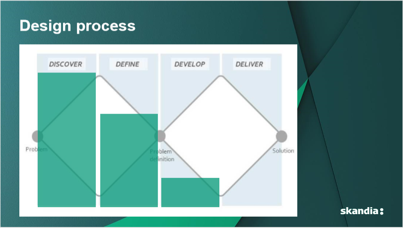
I normally choose Double Diamond as a design process and try to integrate it to the organisations working process.
Outcomes
Keep in mind that there have been numerous outcomes in very different phases. We worked in an agile environment within the SAFe framework and because of that we hardly ever had a straight timeline and worked on only one project. We focused more on specific flows and pages.
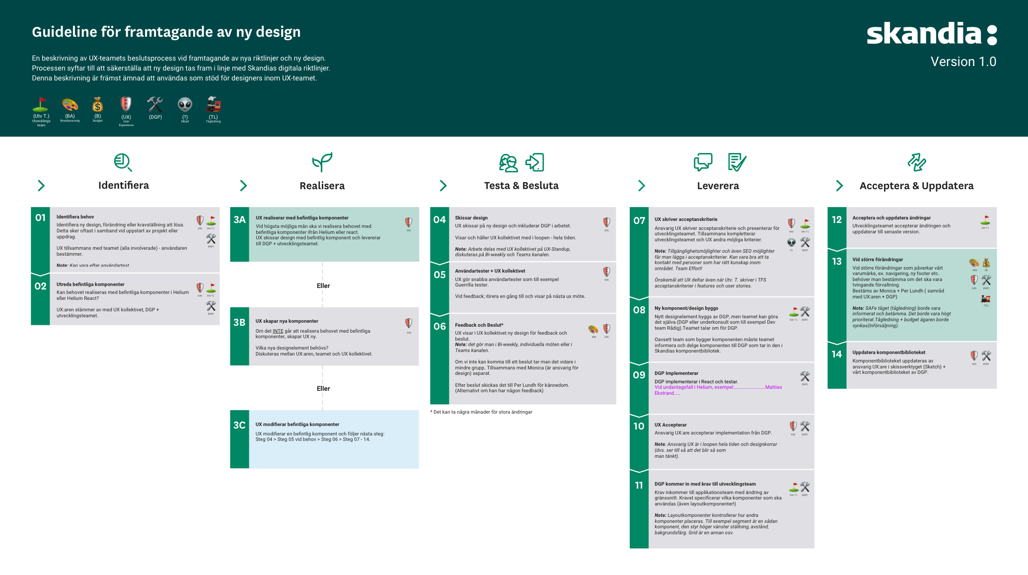
UX handoff to Development team deliverable process
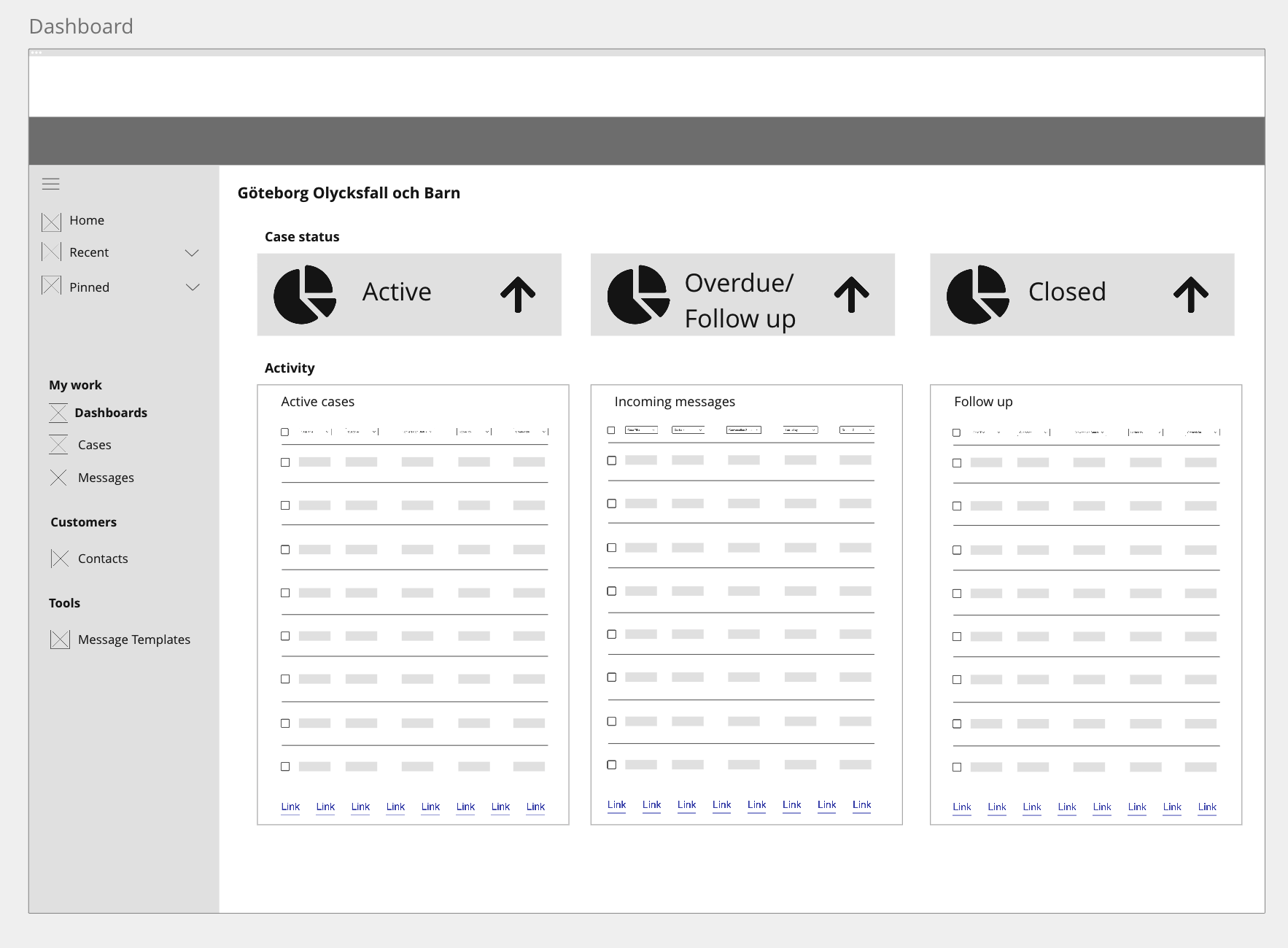
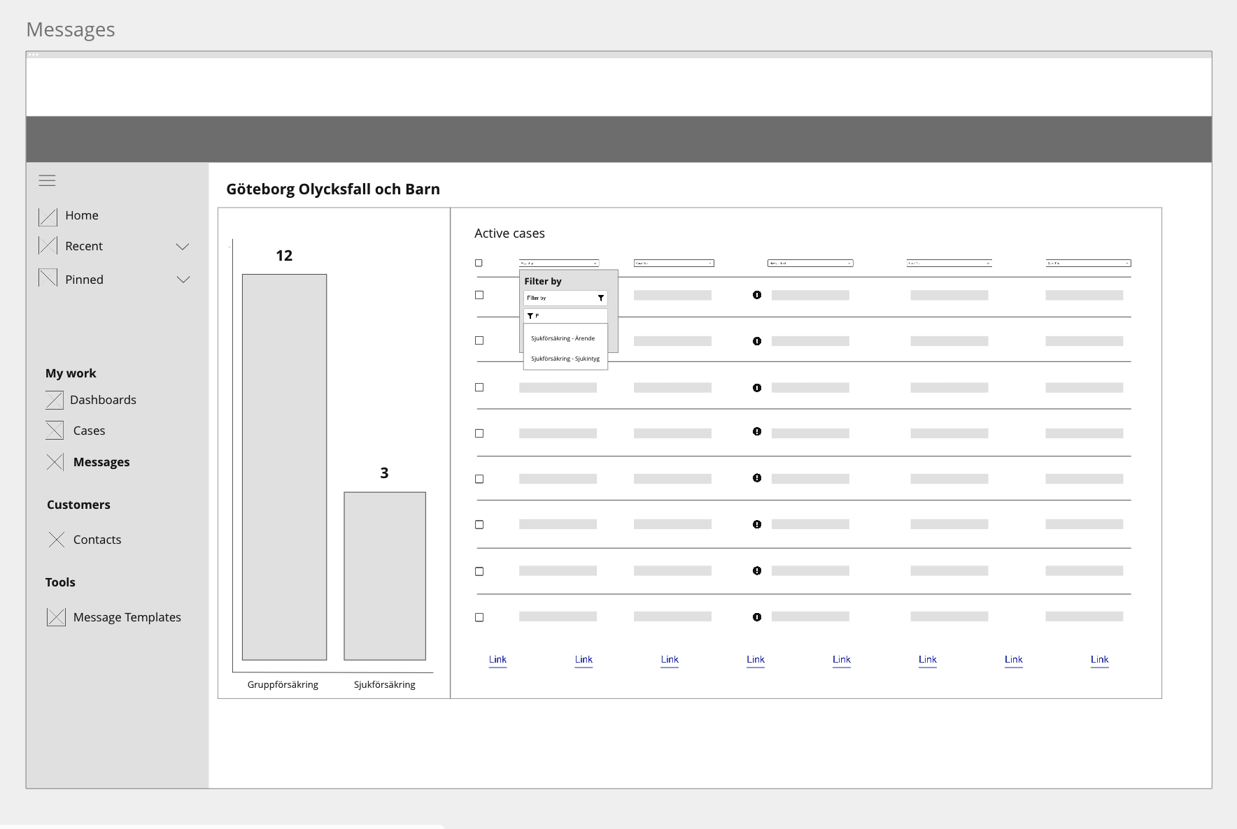
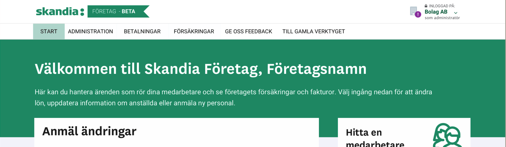
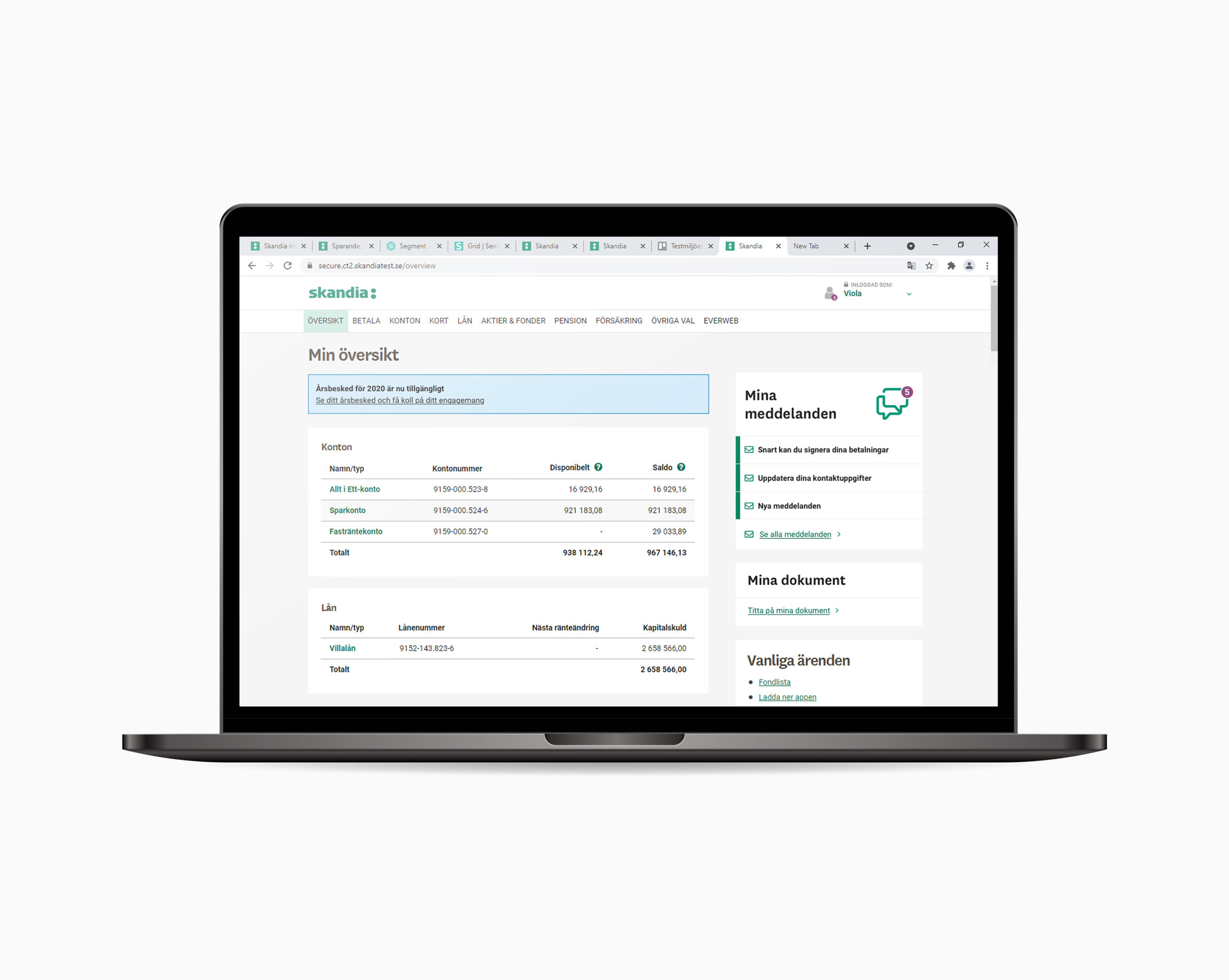
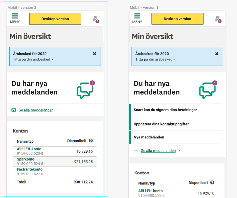
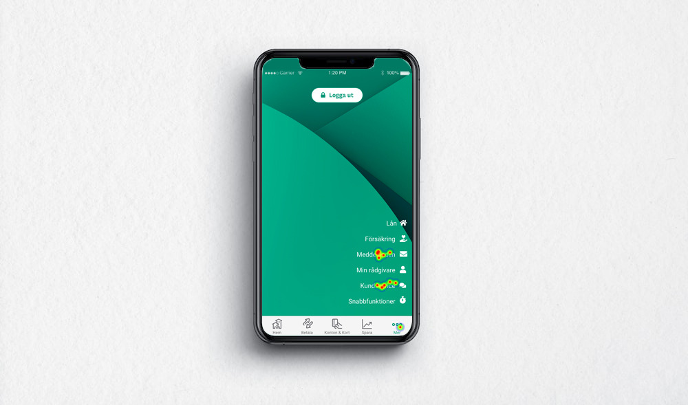
Logged in overview page: My messages and my documents
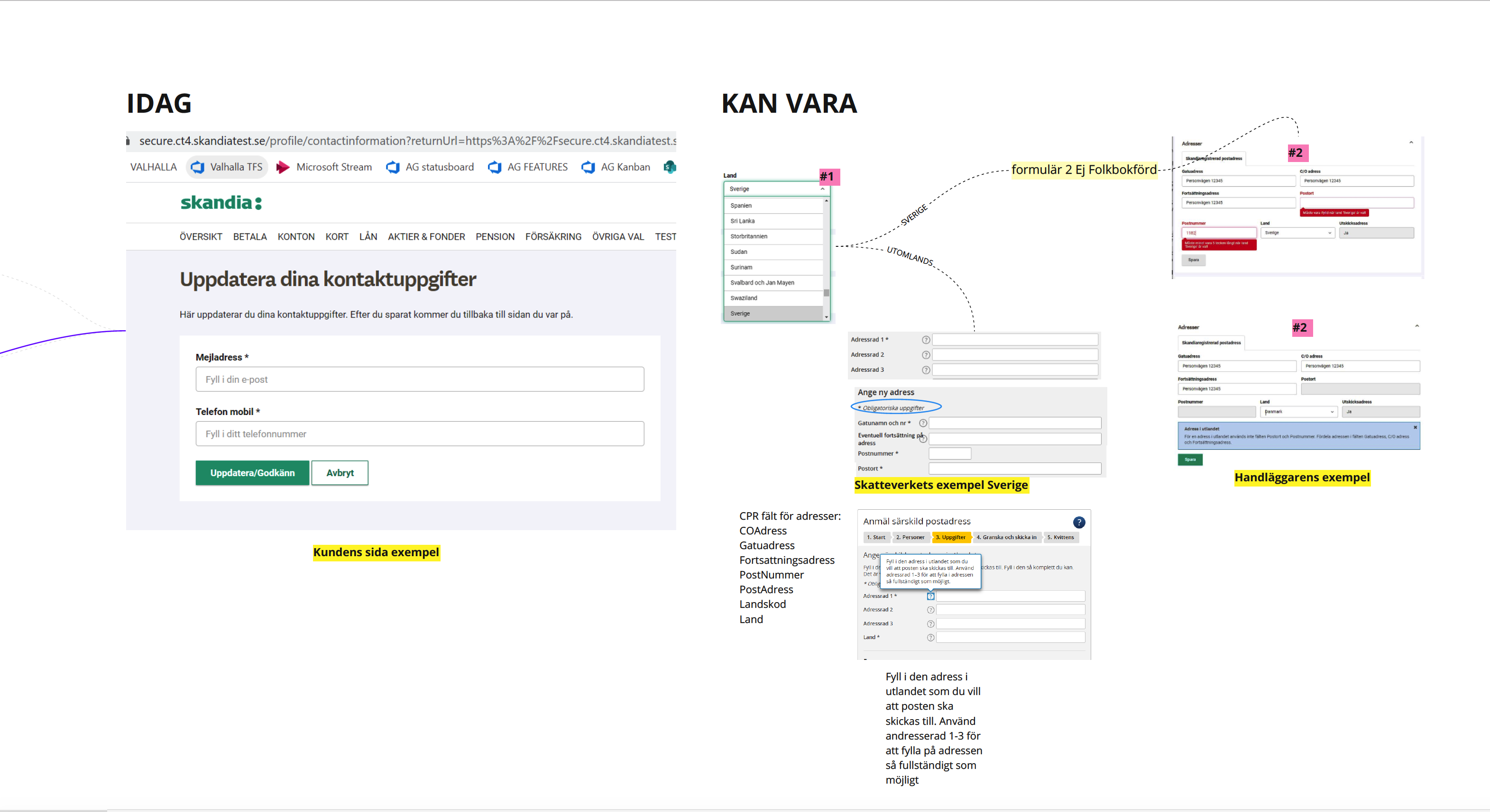
Due to limitations and acceptance process we made some adjustments on current layout. We had other design ideas, but that would change the whole layout so we just made temporary changes to add value and get feedback for future changes. We received comments from support earlier that messages were not always noticed directly, and notifications were not always understandable which is why we also involved copywriters. We also knew that some changes could be made in My documents which is why we tested i too. After brainstorming some ideas and we tested them on our users after which we planned in further evaluation after implementation. We implemented what went well and adjusted what did not go so well.
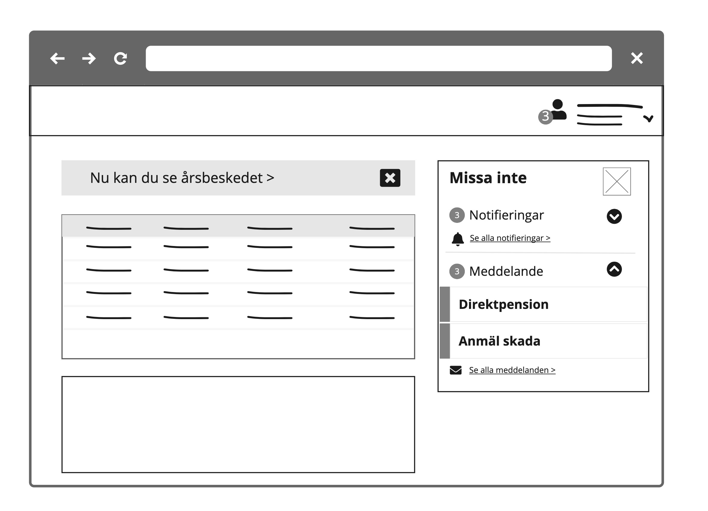
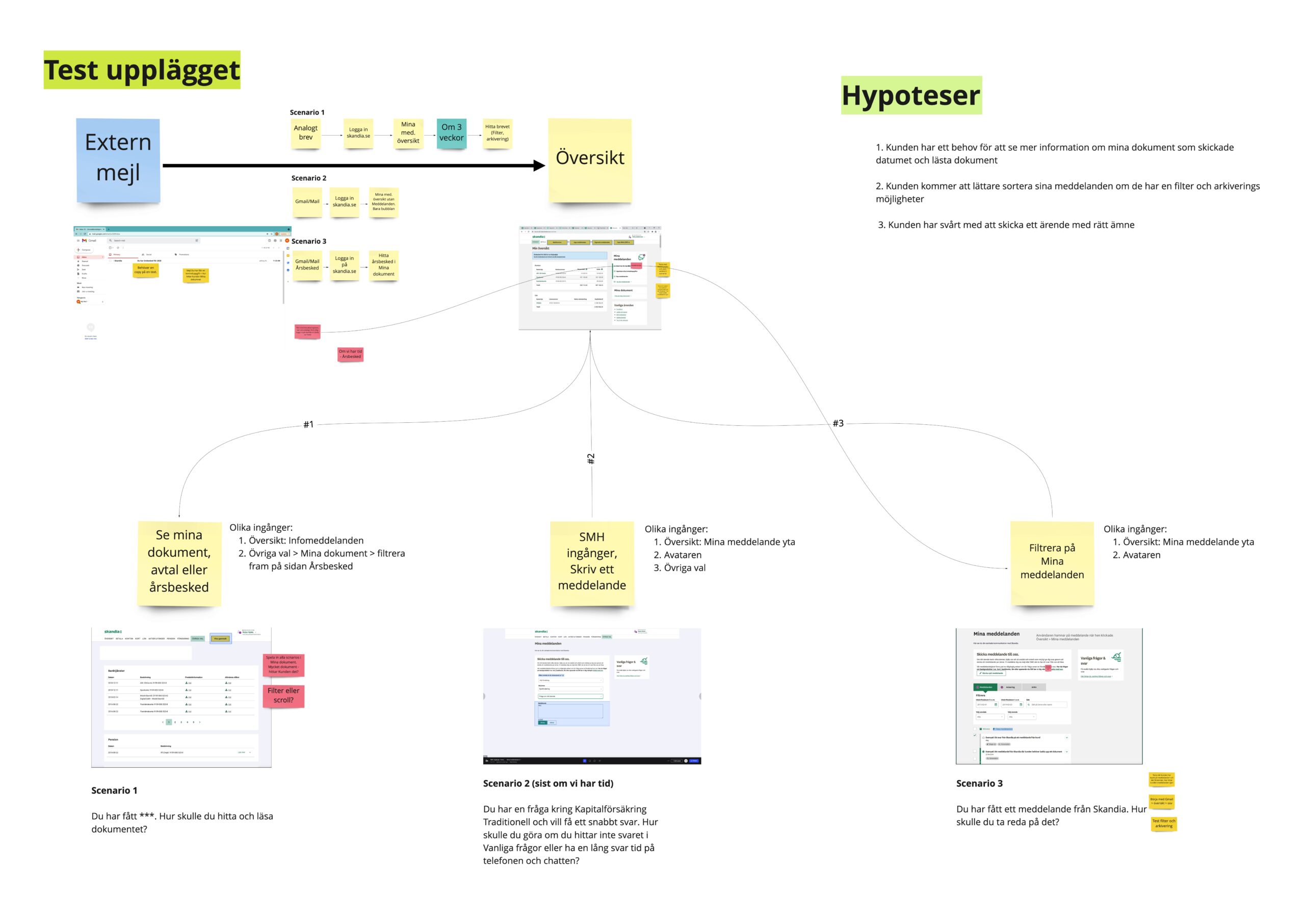
Final implementation for notification and messages which were our priorities:
The Tab reborn
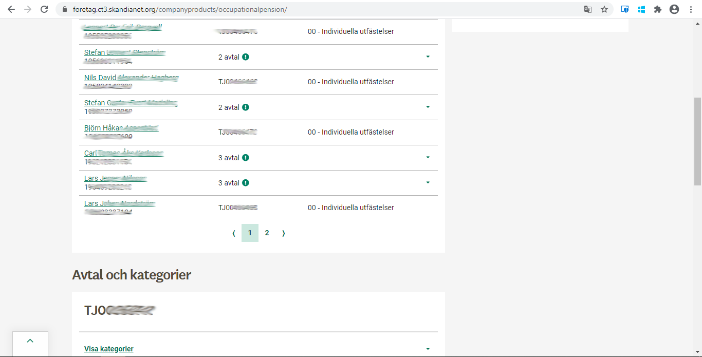
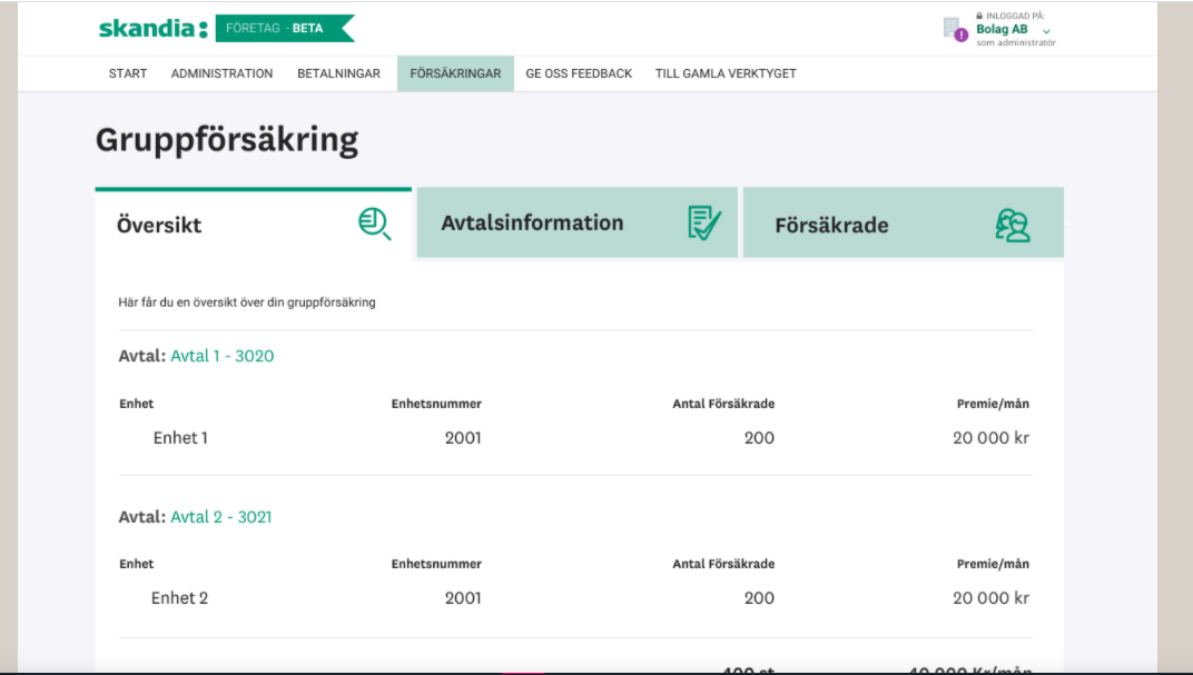
This project focuses on large companies and their needs to keep track on budget. Our main users are Account administrators and HR. The platform was originally built for small scale companies, was researched, tested and built according to their needs. When going through the platform we realised that if we need to adapt this platform to large scale companies which is over 200 employees we need reconsider some priorities on how the user reads needed information - that is how the tab concept was born.
Earlier the use of tabs were canceled due to accessibility issues, not being responsive and not seeing the use of it for our clients.
This is how the company plattform looked like. All information were in modules and places after one another.
Getting to know our users
We had did some research with experts, service, gathers best practices and most importantly interviewed and tested our users. That way we were sure that our users need an overview just to see briefly company agreements in total, then search for individuals when needed and also have access to CSV, excel, when to add/delete individuals etc.
Focusing on accessibility
As a designer who genuinely works towards inclusive design I have helped Skandia with awareness about accessibility and inclusive design. Today both designers and developers try to build Skandias products making them more accessible. It is a process that takes time and for now it is implemented gradually to different focus areas and being planned.
Information Architecture and structure: Speak your user's/customer's language
Creating more independent features with the right information and process in order to reduce pressure on customer service and have happier clients has been my main focus. We had to understand that the way we speak inhouse is not the same way customers speak. User's normally need to see keywords that they understand to be able to solve a task and if we don't use recognisable terms the customer either just leaves creating drop-offs or contact's customer service which in turn creates questions and frustration at the service desk. Together with Copywriters we brainstormed on improving Skandia's information architecture (AI) for their website, we focused on both logged in users/customers and visitors, the first stage of the improved menu is already live for visitors and has shown improvements according to analytics. Next stage to be continued for logged in users. In order to make sure that this hypothesis works the menu has been monitored. Also a feedback tool (Usabilla) has been implemented for gathering feedback from Users.
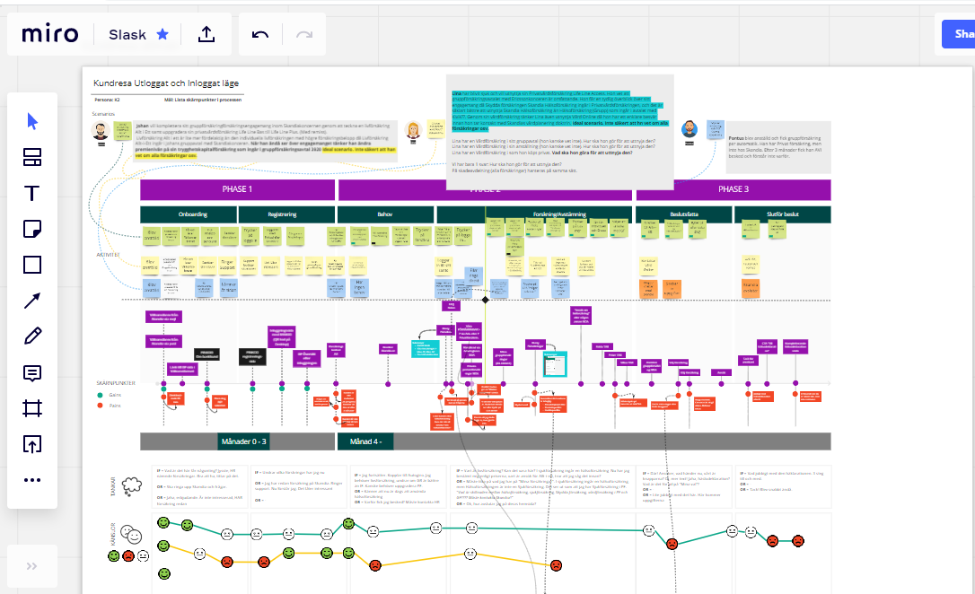
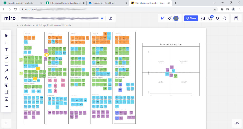
I also contributed in introducing new tools such as Miro and even testing tools due to our remote work. That way we made collaboration easier.
Mobile application
Conducted user tests and guerrilla tests where we got to test our hypotheses which resulted in some iterations. During the tests, we caught other things that can be improved in Skandia's mobile application and website. Test subjects were primarily customers who shared with us their insights in other areas. An important part of the work process was to develop transparency with stakeholders and the team altogether. They could participate and observe in user tests, get a look and listen to who we create design for. Thanks to online tools, we were able to create an environment where the customer / user felt comfortable and was not disturbed by the number of people who participated in the user test.
As a facilitator, I needed to adapt to the digital type of testing, where I created a system to perform user tests with the tools we had access to. We primarily used Teams. In other projects we tried Lookback, but questions about safety and storage arose. Another tool we used for the tests was Useberry, where we could collect heatmaps and the trip to see pressure behaviors when we do not see it behind the camera.
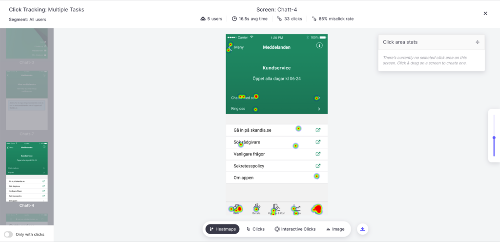
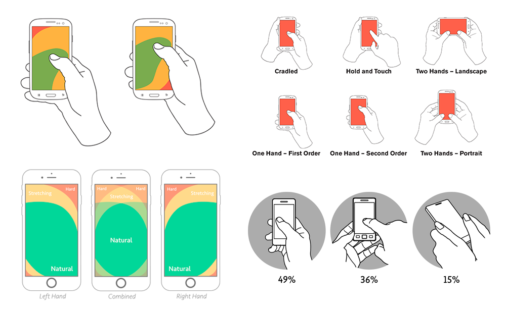
To understand why customers press the screen as they did, we analysed which parts are most available depending on phone models. We worked together with customer analysts to investigate which devices and browsers customers use, as well as their most visited pages and trends. Speaking of trends, that also is an important for new design solutions. Another very important topic has been awareness of accessibility guidelines and inclusive design altogether.
Activity
• Stakeholder interviews
• Collaboration with client and product owner
• Full collaboration with development team
• Team workshops
• Design studios
• User tests
• Sketching & wireframes
• Creating prototypes
• Accessibility research and report
Deliverables
• Information architecture & structure
• User and UX flow
• Wireframes
• Prototypes
• User Interface (UI)
• Style guide
• UX Strategy
Tools
Prototyping, flow diagrams and user tests
- Sketch
- Invision
- Adobe XD
- Overflow
- Miro
- Useberry
- Teams
Handoff and versioning tools
- Invision
- Sketch
- Miro
- Power point
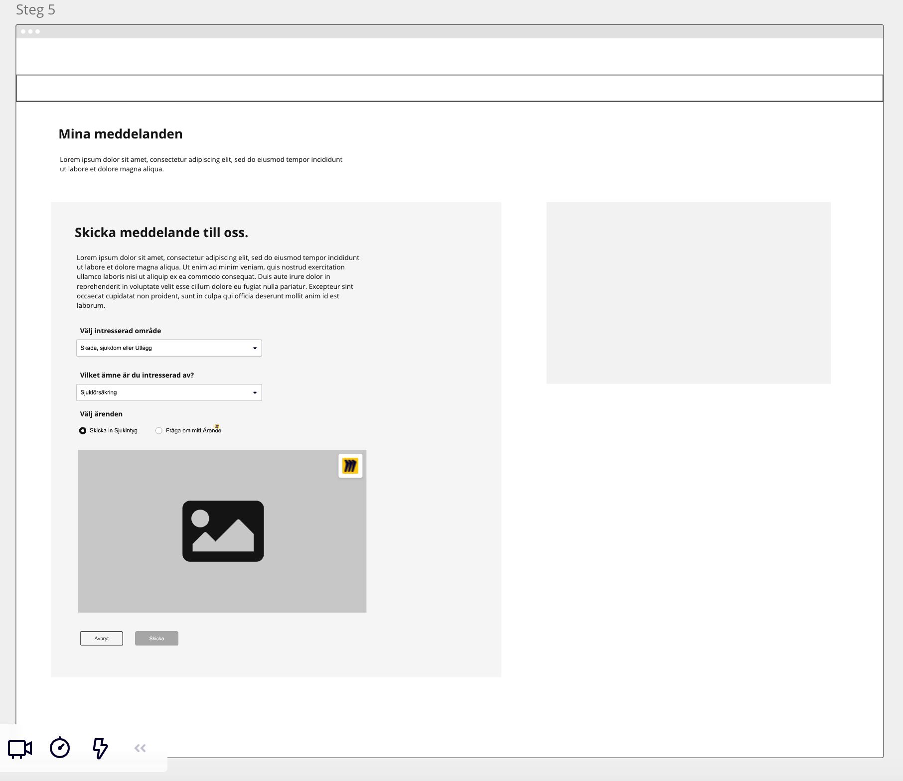
Some more wireframes and design on different topics