Cowab
Design solutions for Cowab
Creating solutions for e-commerce website Cowab.
Using a new CMS based on Epi-server, A lot of prototyping involved, working in an agile environment and creating the best fit UI/UX deliverables for developers.
The process of this project:
1. Analyse current problem;
2. Find numerous solutions;
3. Create user flow;
4. Wireframe;
5. Hi-fi prototype;
6. Create awesome deliverables.
Tools used in this project:
-Adobe XD;
- Zeplin;
- Sketch;
- Invision.
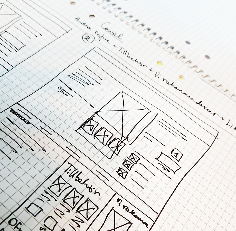
Basic wireframing with paper and pen.
Agile management tools: Jira;
Team communication: Teams
Below you can see some of those UX solutions presented.
Product page
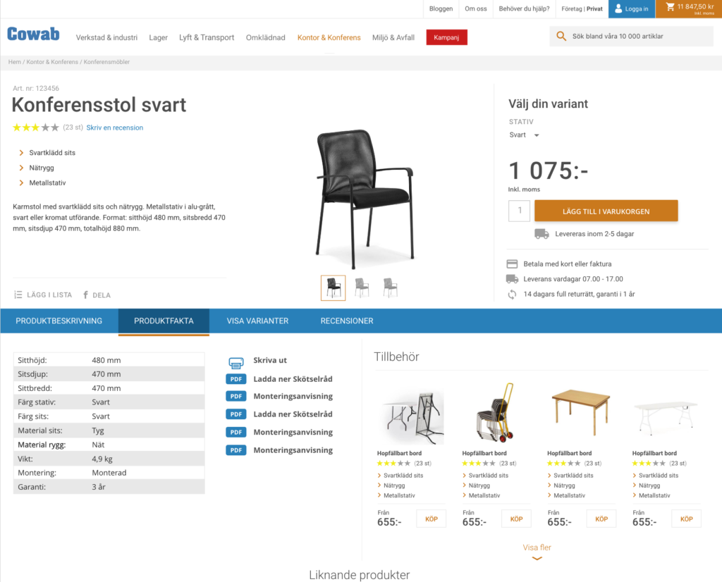
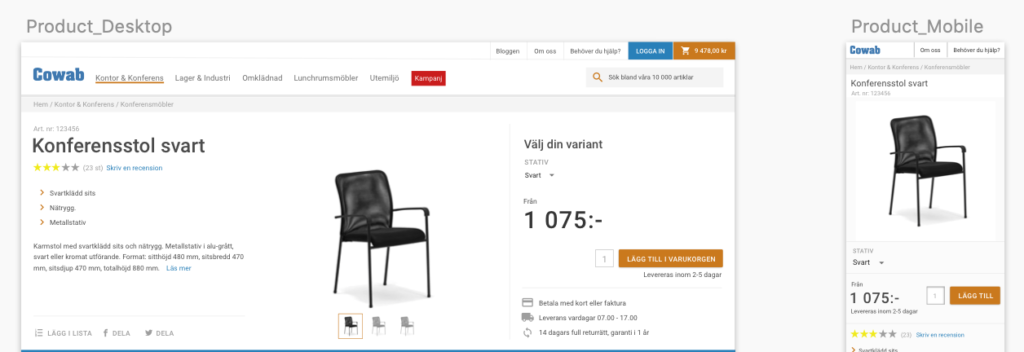
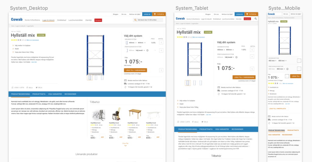
Create and find a simple solution for both desktop and mobile. Think tiles through out the whole process. Design for this had been processed in multiple iterations. One of the tasks for this design was to find a solution on how the buy button will be easier to implement for both mobile and desktop code wise. The first design version we had received was not practical.

Before
Mobile menu and menu navigation
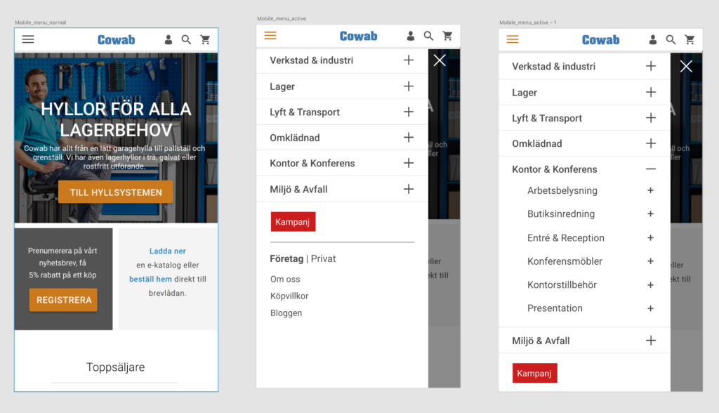
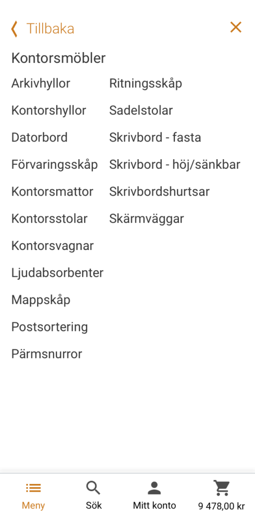
The delivered design we received from the client looked more like a native application for iOS. It was decided to make it more consistent and easier for the developers to implement skipping bugs.
The mobile menu design allows the user to feel they are still on the website and at the same time give them a better look and feel while navigating.
Before
Mega menu
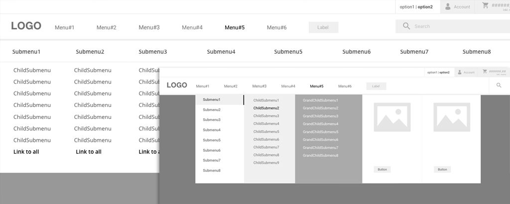
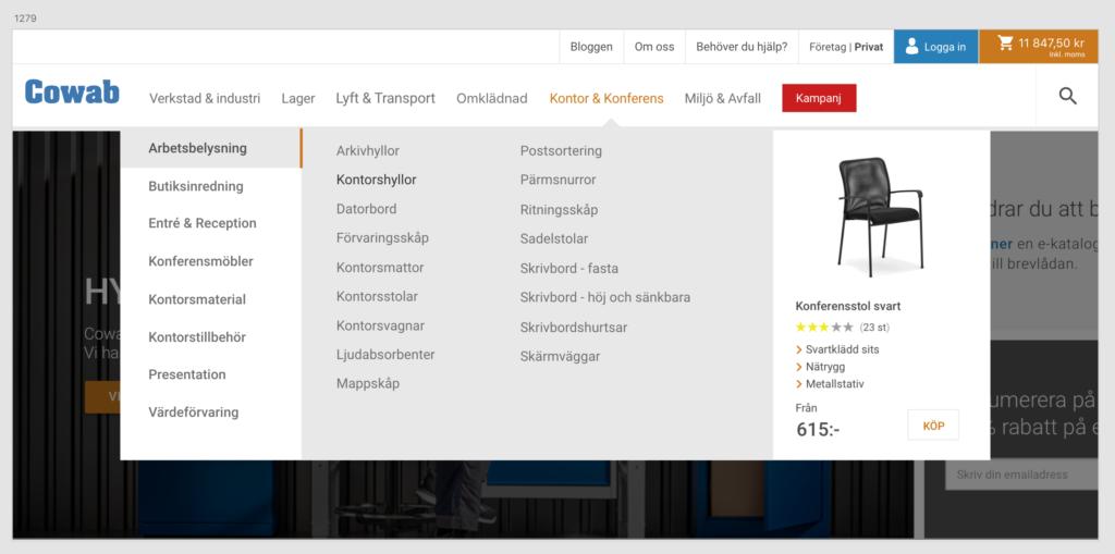
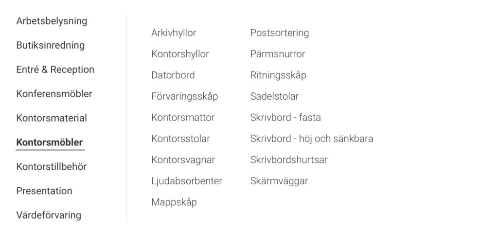
Because the website consists of a lot of pages and products, the mega menu was a great solution. The mega menu did not just allow the user to navigate all pages, but also helps the user to see promotions, campaigns and just interesting offers. The user can even add the interested product to the basket right from the menu.
Before
Sketch example
