Anticimex back office tool

Creating MVP based on previous research
UX process and WoW | Design solutions | Design system | Deliverables
Anticimex works with pest control in a smart way and has an application that is used by technicians to help install trap and detecting devices, which later should be reported to back office managers. Under a period of time I worked on creating a back office management tool which would be used later for preparing tasks for technicians and analysing device conditions and furthermore a general understanding of trend events. For starters we worked on the MVP and designed future design solutions both rich visually and with nice-to-have features.
Note: this an ongoing project which means the are design solutions that are not presented on this page and some are yet to be updated.
Anticimex is an international service company that was founded in Sweden in 1934. The name comes from the Greek word Anti, which means Against, and the Latin word Cimex, which means bedbug, i.e. against bedbugs. The company has around 10,000 employees and is present in 21 countries.
Outcome
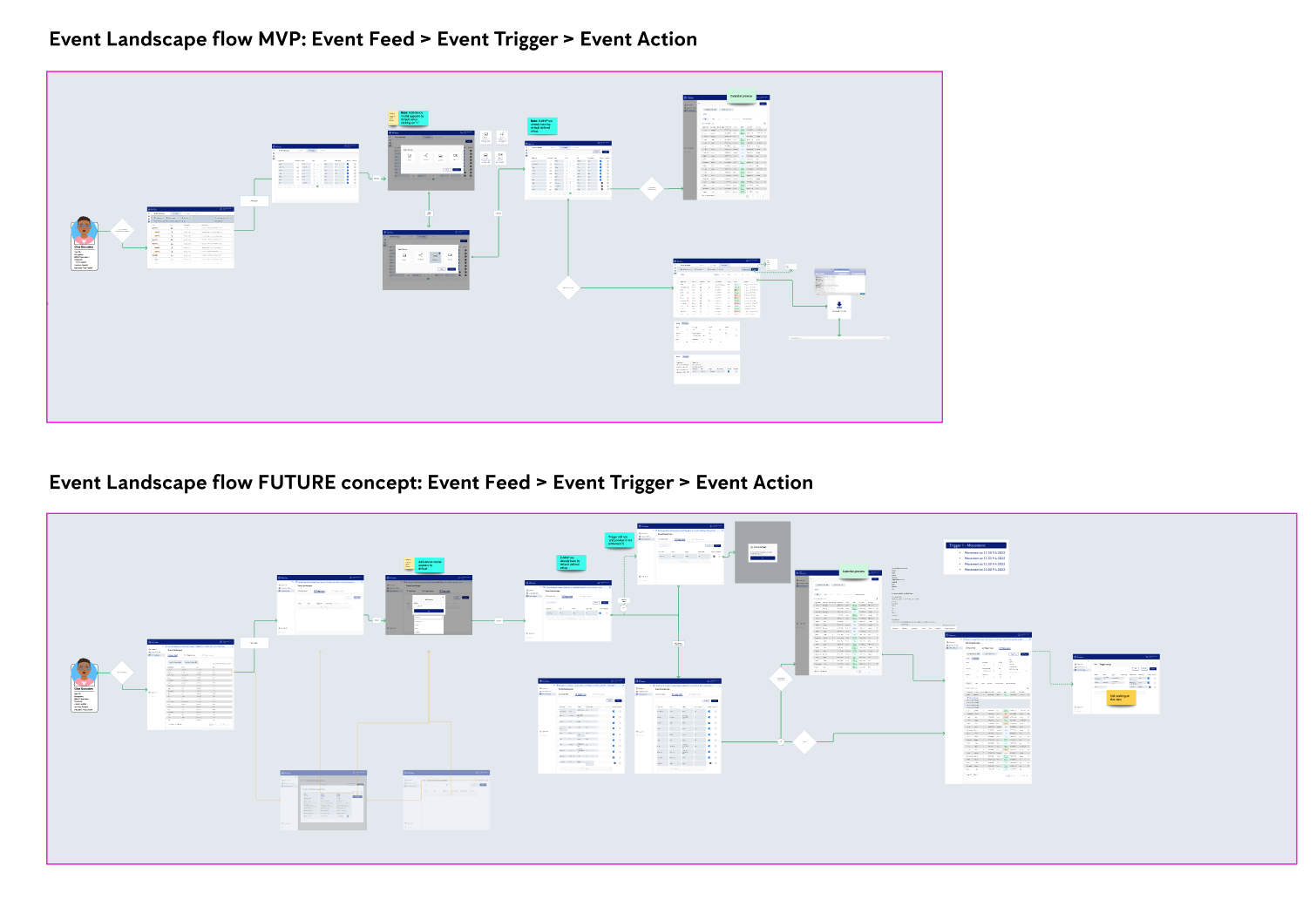
Flow demonstration. Keep in mind that this project has many releases and updates. This was the last one I delivered.
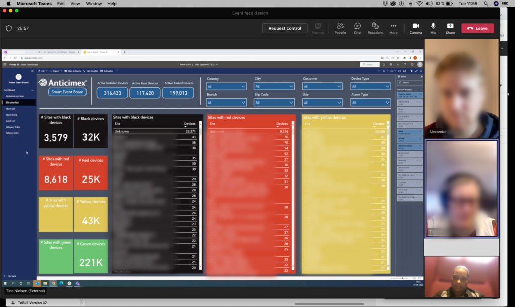
Before
Assignment & Responsibility
Map out a UX strategy plan, define the design process and which tools will help reach Anticimex goals. Apart from UX planning I worked on the Visual design concept and design system. We worked in Kanban and worked with tools like Jira and Productboard and in general worked closely with the Product Owner/Project Leader and Developers. Some gaps in communication existed and were pointed during meetings like Retrospective. The maturity of the team in terms of way of working was low and would need time to learn from mistakes, test new ways of working and modify what works well. As a result of our collaboration we had multiple releases and the MVP had been shared with a group of users to test.
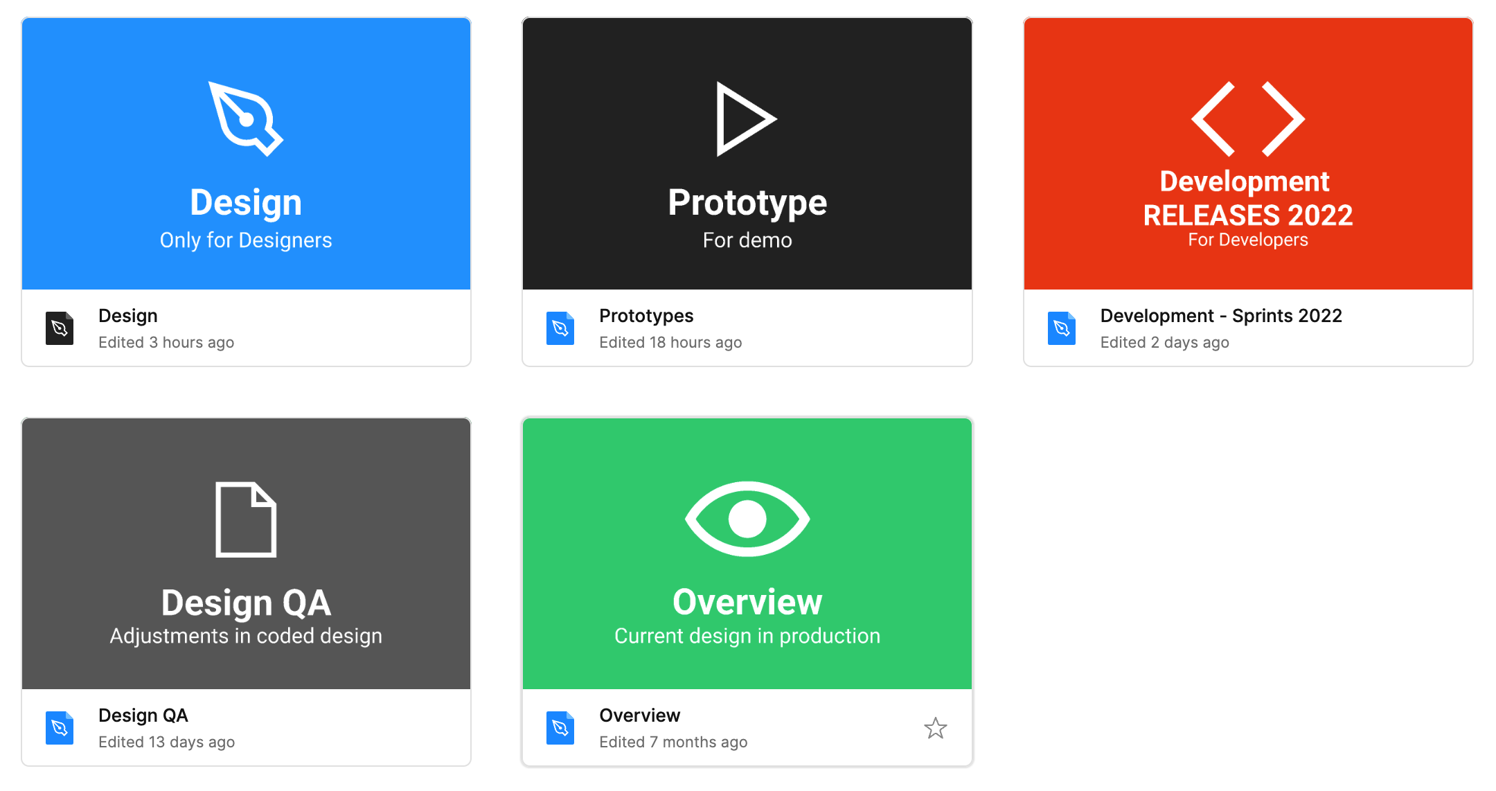
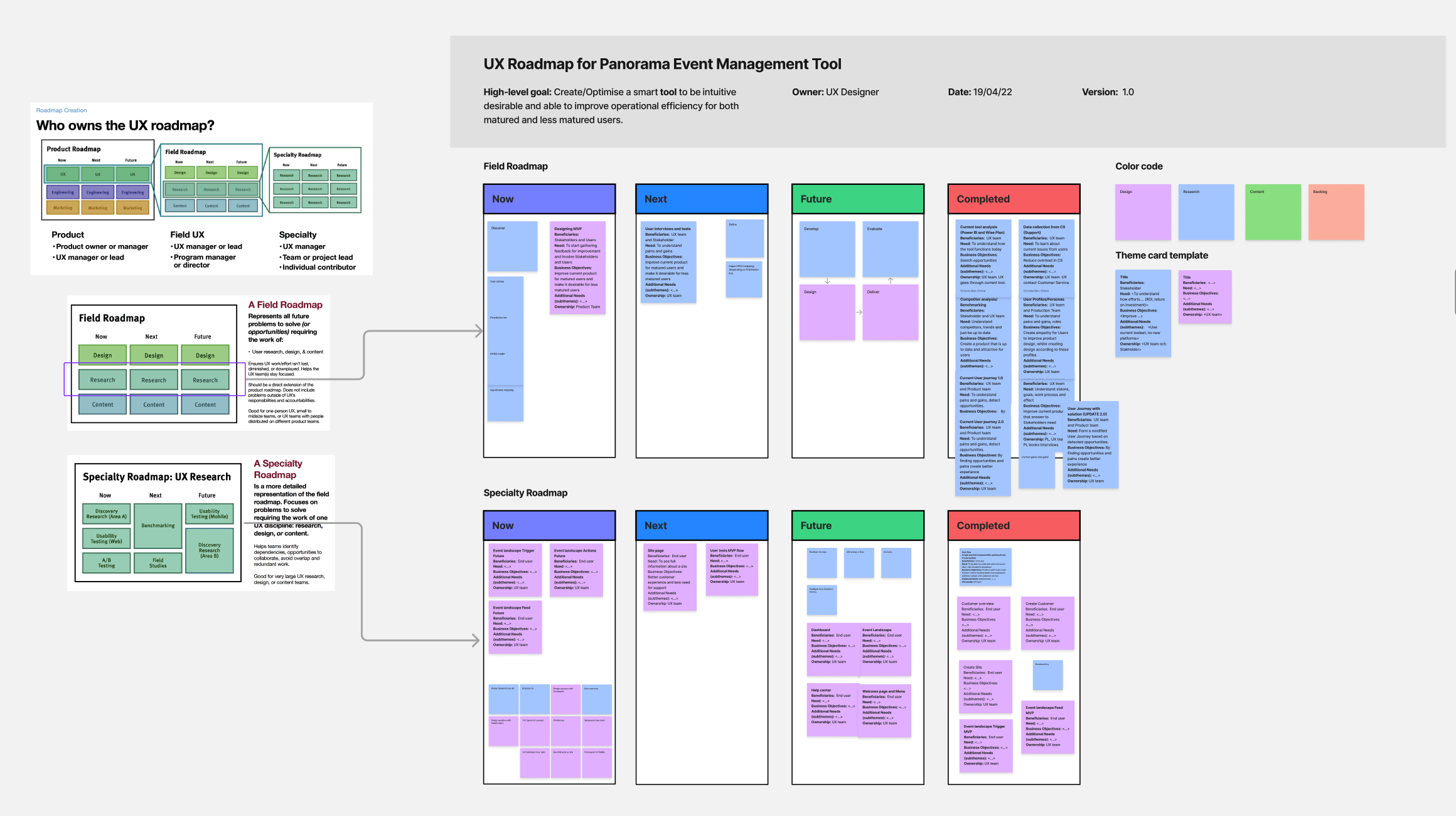
We had a design field Roadmap at place and chose Double Diamond as the design process.
Activity
• Stakeholder interviews
• Collaboration with client and product owner
• Full collaboration with development team
• Team workshops
• Design studios
• User tests
• Sketching & wireframes
• Information Architecture and Structure
• Creating prototypes
• Accessibility research and report
Process and result
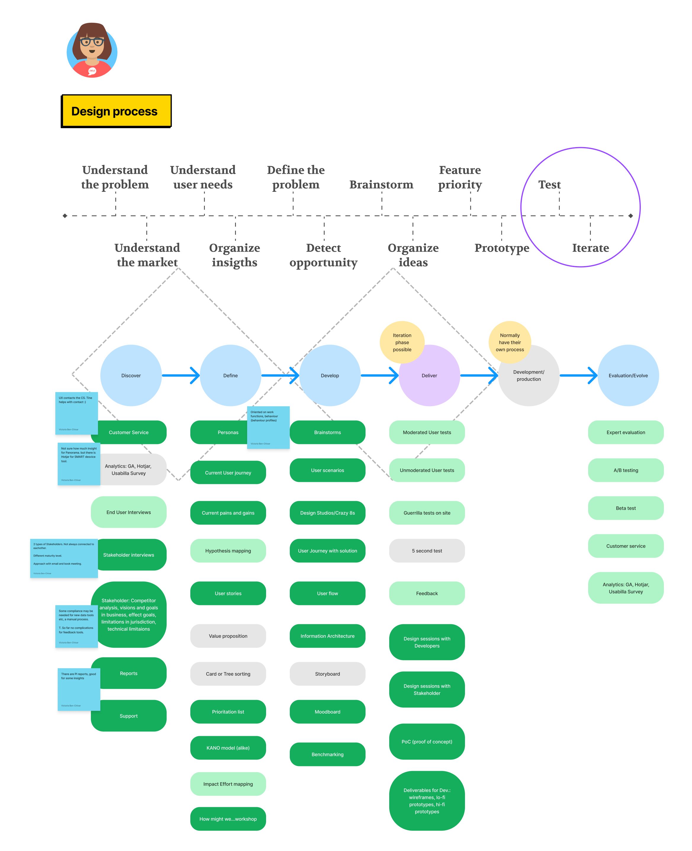
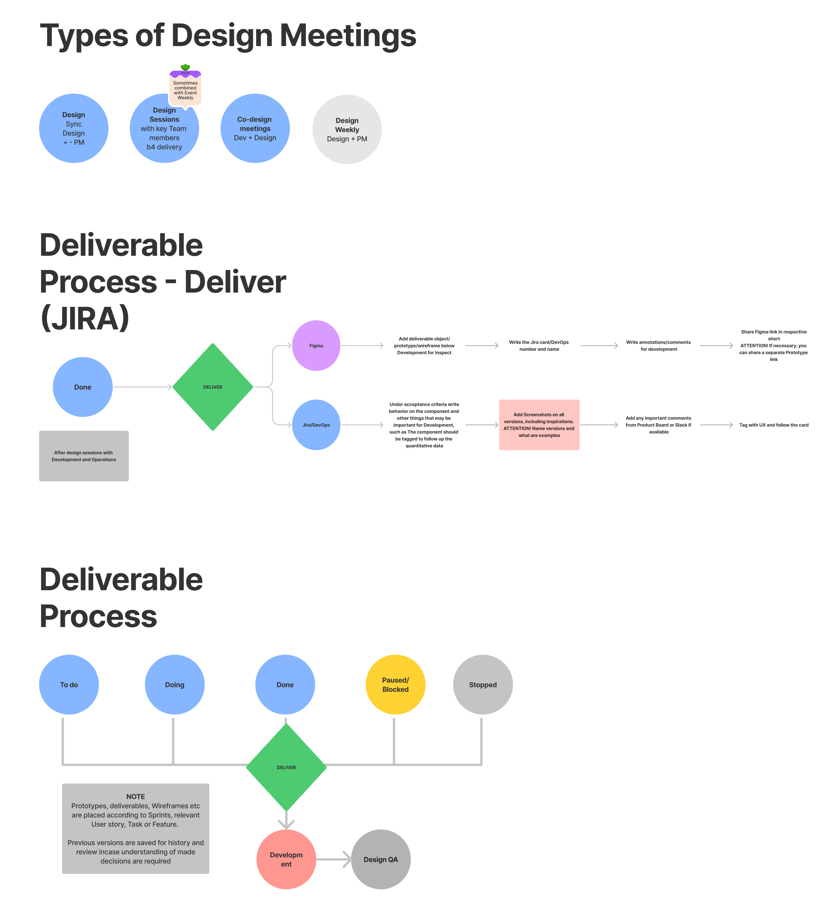
We implemented from the start a deliverable process and during this project it was modified.
• UX Strategy
• UX Roadmap
• Design and deliverable processes
• Interviews with stakeholders, support and users
• Information architecture & structure
• User and UX flow
• Wireframes
• Prototypes
• User Interface (UI)
• Design system
Tools for Prototyping, creating flow diagrams and performing user tests
- Figma
- FigJam
- Teams
Information Architecture
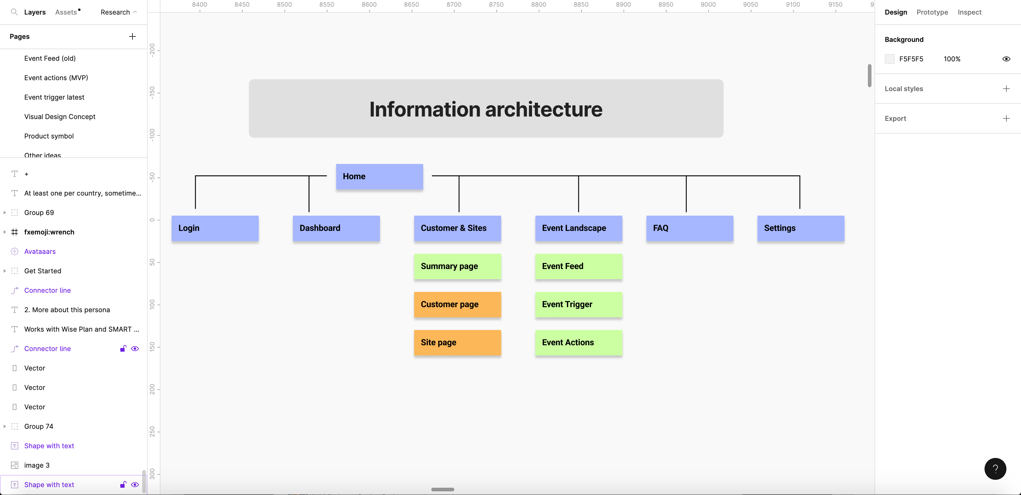
information architecture for panorama
Guidelines for deliverables
Discovery phase
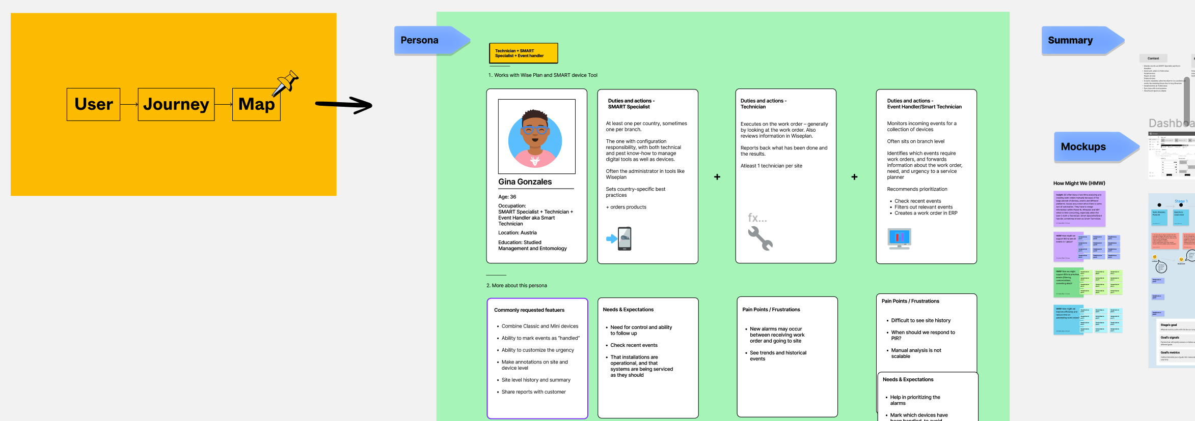
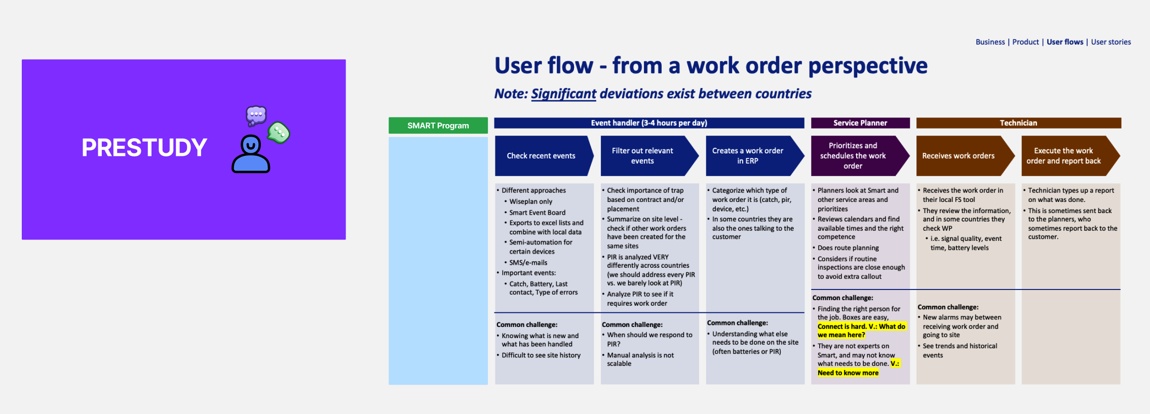
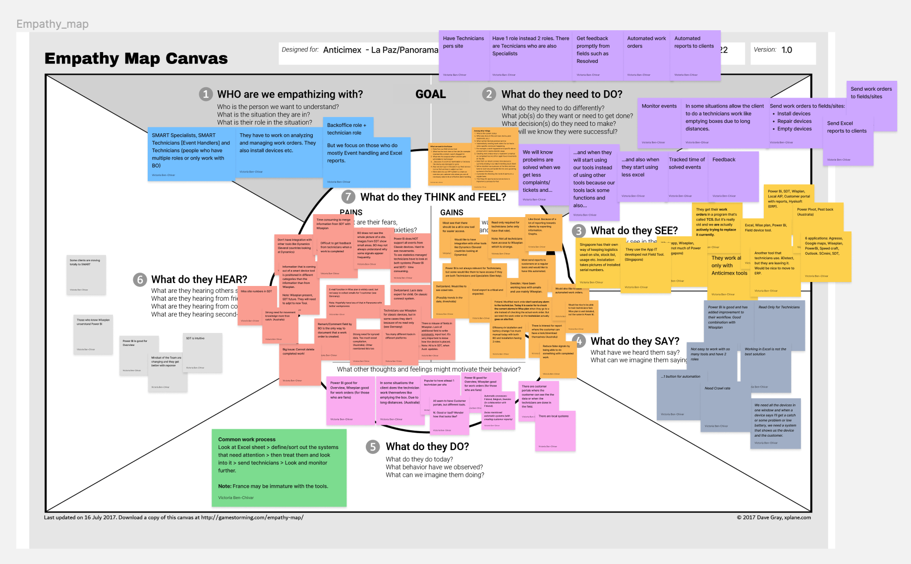
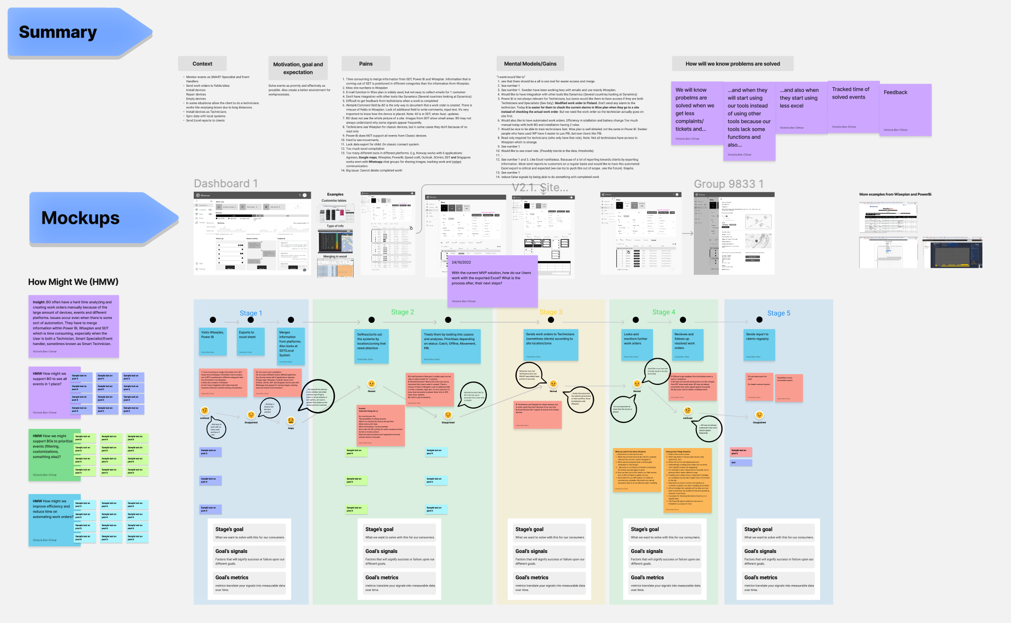
We performed interviews and gathered data, talked to support and stakeholders, gathered user insight and all possible people involved in order to understand pains and gains.

MVP first release
This project focuses on back office managers that oversee what events come from Anticimex devices and send tasks to Technicians to solve. We started little and adjusted on the way.
We were confident with the solutions after taking interviews and looking into the User Journey. So to produce something and gather feedback it was chosen to proceed with the MVP and later with more maturity perform user and usability tests.
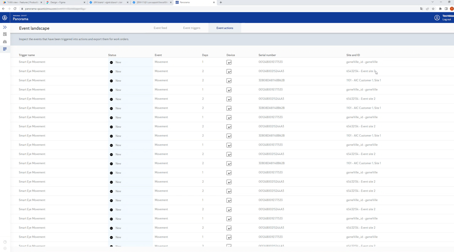
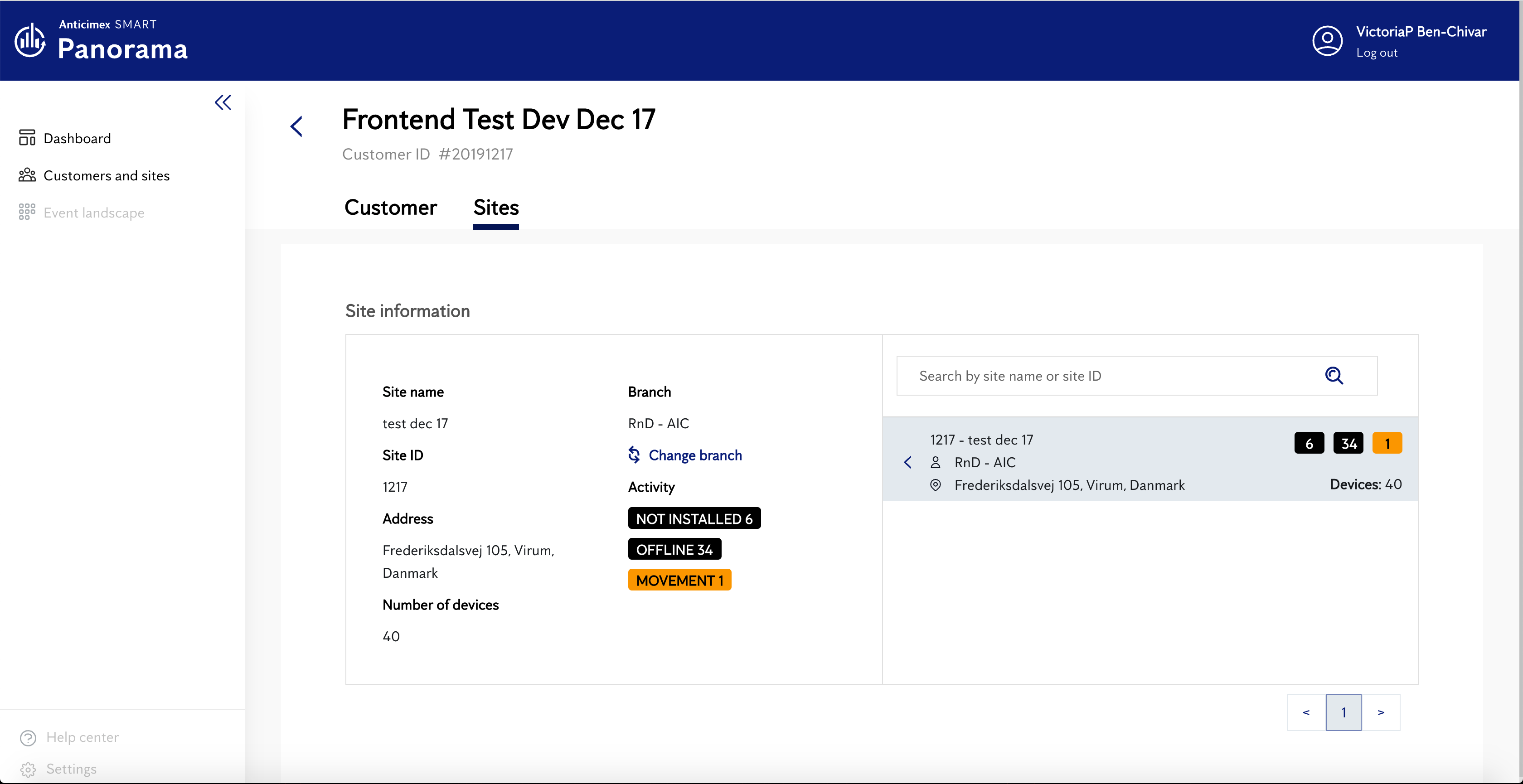
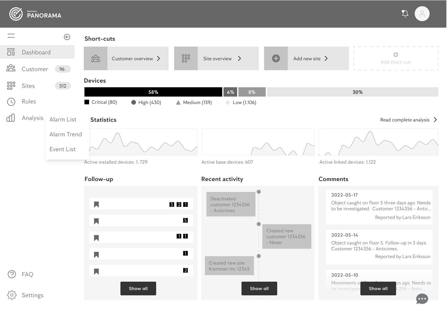
From wireframe to hi-fidelity example: Dashboard
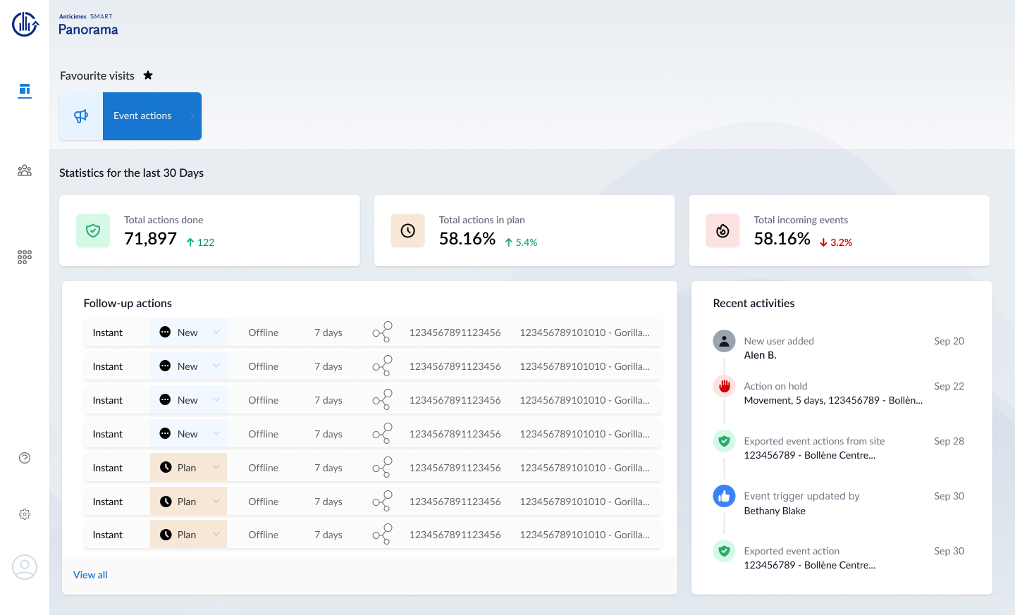
Visual Design concept and future features
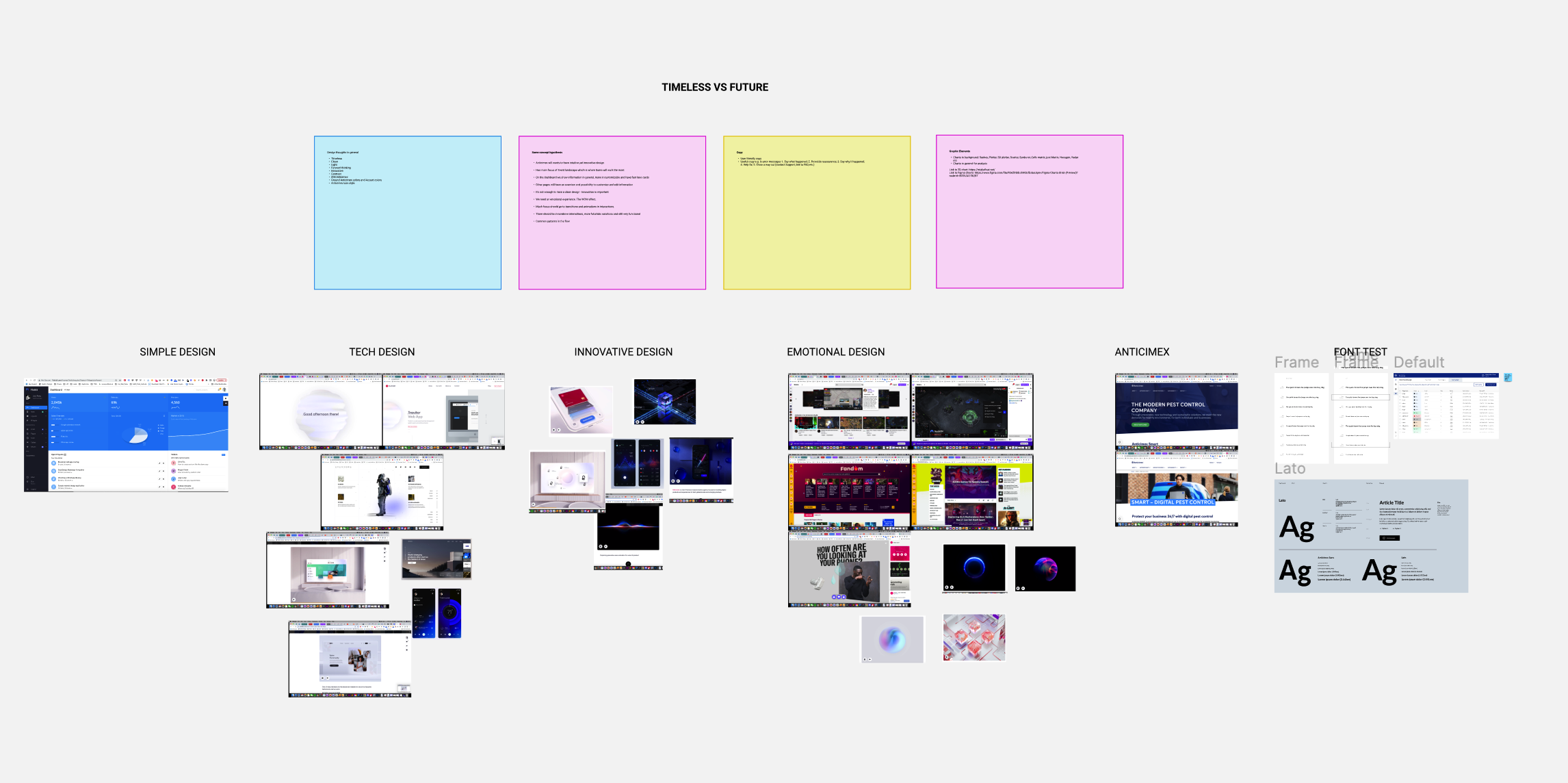
Creating more independent features with the right information and process in order to reduce pressure on customer service and have happier clients has been my main focus and on top of that Look and Feel with ambition.
Users would be able to customise and have a choice. We looked inte more innovative solutions like dynamic tables, menu and other functions, looked into hidden yet visible features. Something we also looked into was a nice to have lika a Dark and Light theme. In general create a pleasant look and feel.
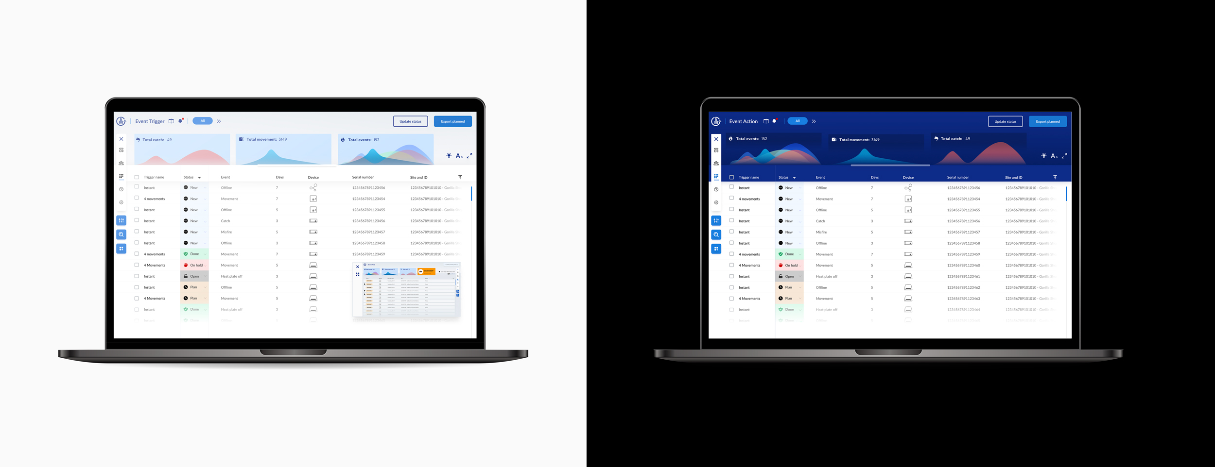
Dynamic menu concept
The idea is to allow the user to move the menu from left to right and top, but if technically allowed the menu could be placed anywhere on the screen and the user could also change the prioritisation. Depending on the page the lower blue buttons change, e.g. on some pages you do not need table settings or extra plugins. The reason for this solution is to give a user broader space for tables as they work a lot in this environment.

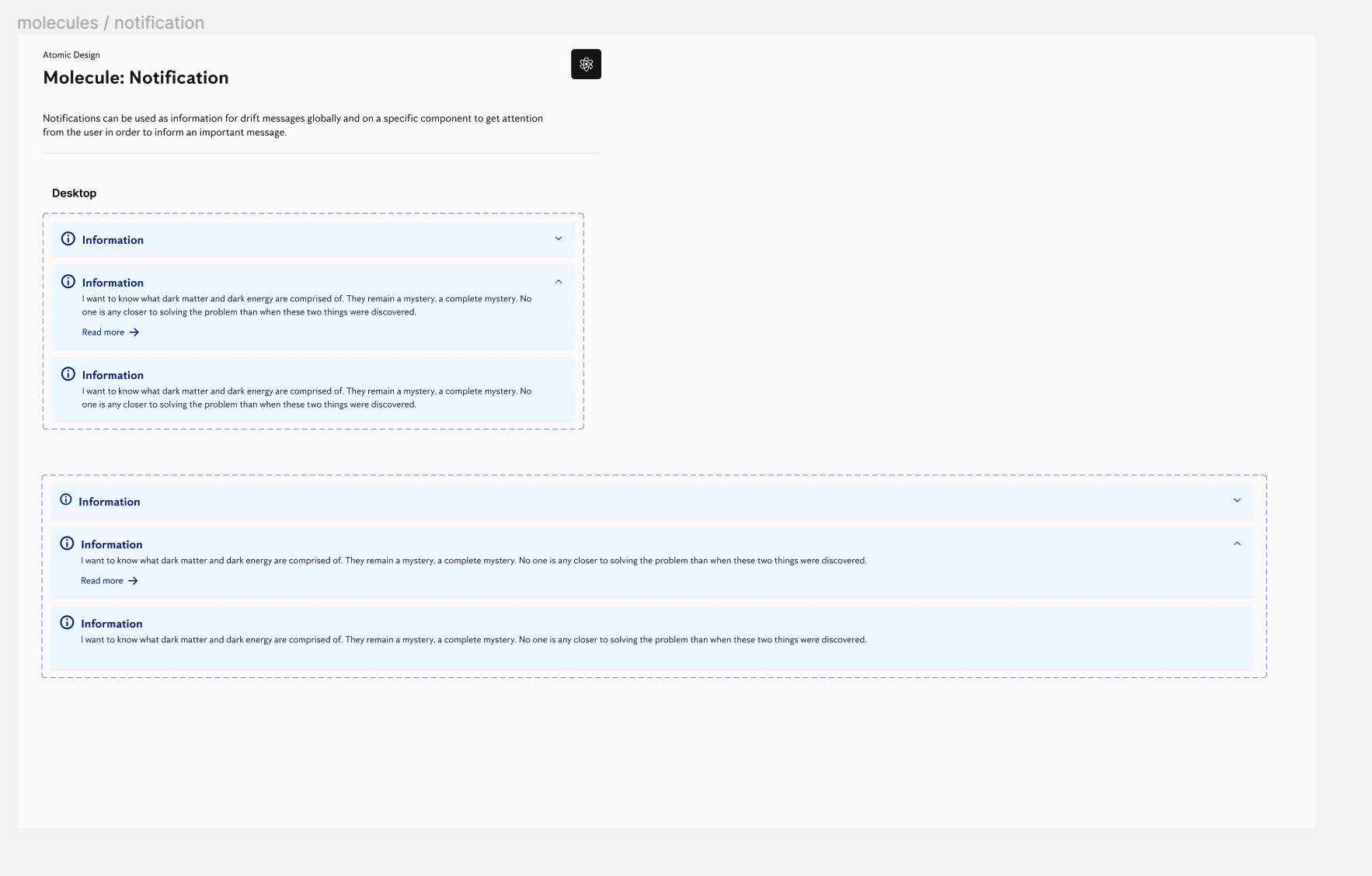
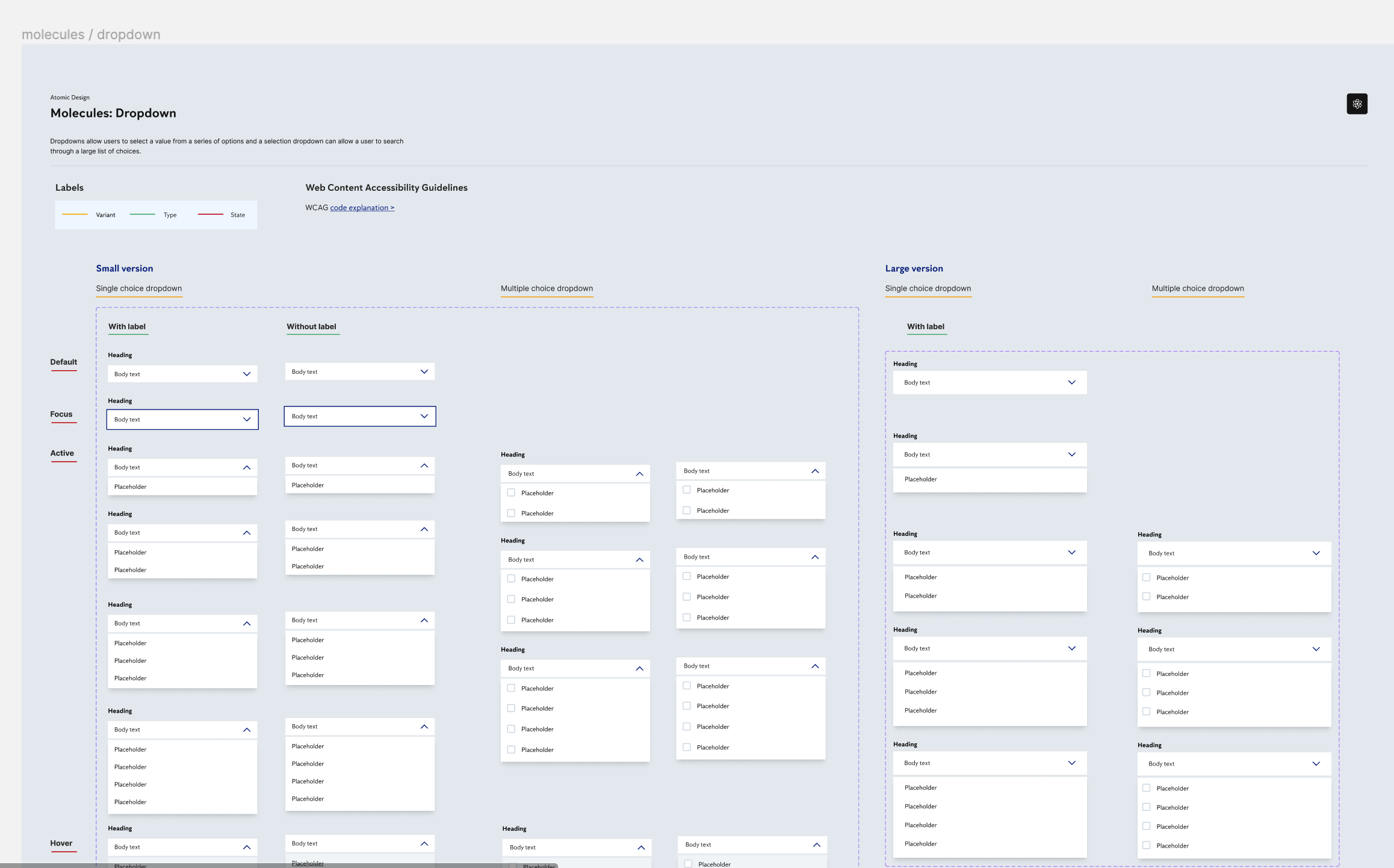
Design system example
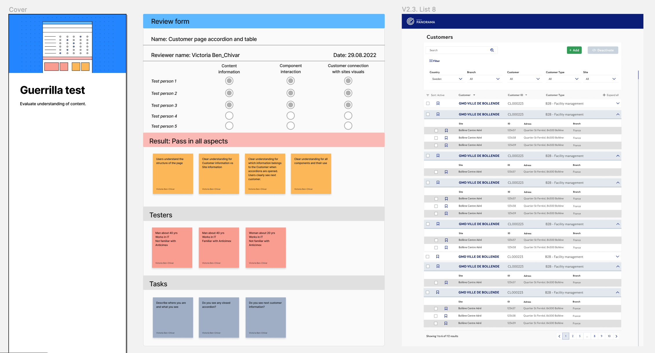
Guerilla test
