Chalmers University of Technology in Sweden

Phase 2 - Creating MVP based on previous research and visual design
UX process and WoW | Design solutions for accessibility | Design system | Deliverables
Under high pressure we moved straight to sprints in order to create a functional MVP. There were 2 phases in this project: Phase 1 - research of target audience and design look and feel, Phase 2 - implementation, design modifications, design system, information architecture, usability tests and production. I joined Phase 2 as UX lead and Visual Designer. One of our main tasks was to see that our design is WCAG 2.1 compliant.
Note: this an ongoing project which means the are design solutions that are not presented on this page due to confidentiality.
Chalmers University of Technology is a technical university in Gothenburg, which was founded in 1829. Chalmers has been driven as a foundation with the operations transferred to a company owned by the foundation since 1994 known as Chalmers tekniska högskola AB.
Assignment & Responsibility
Stakeholder's main goals: Attract more students form both Sweden and abroad, gain better reputation among current students, be WCAG compliant and inclusive. Lead the Design Process, deliver a design strategy, adapt a new Visual Design according to WCAG and create a design system together with the development team. To work effectively we had multiple workshops such as Information Architecture workshop, Design System workshop, Sprint workshops etc. We were a team of about 8 from Maverick and more from Chalmers. We were 2 designers that helped each other to speed up the process due to limitations and during this period we exchanged roles according to our strengths and capabilities.
Outcome
Process
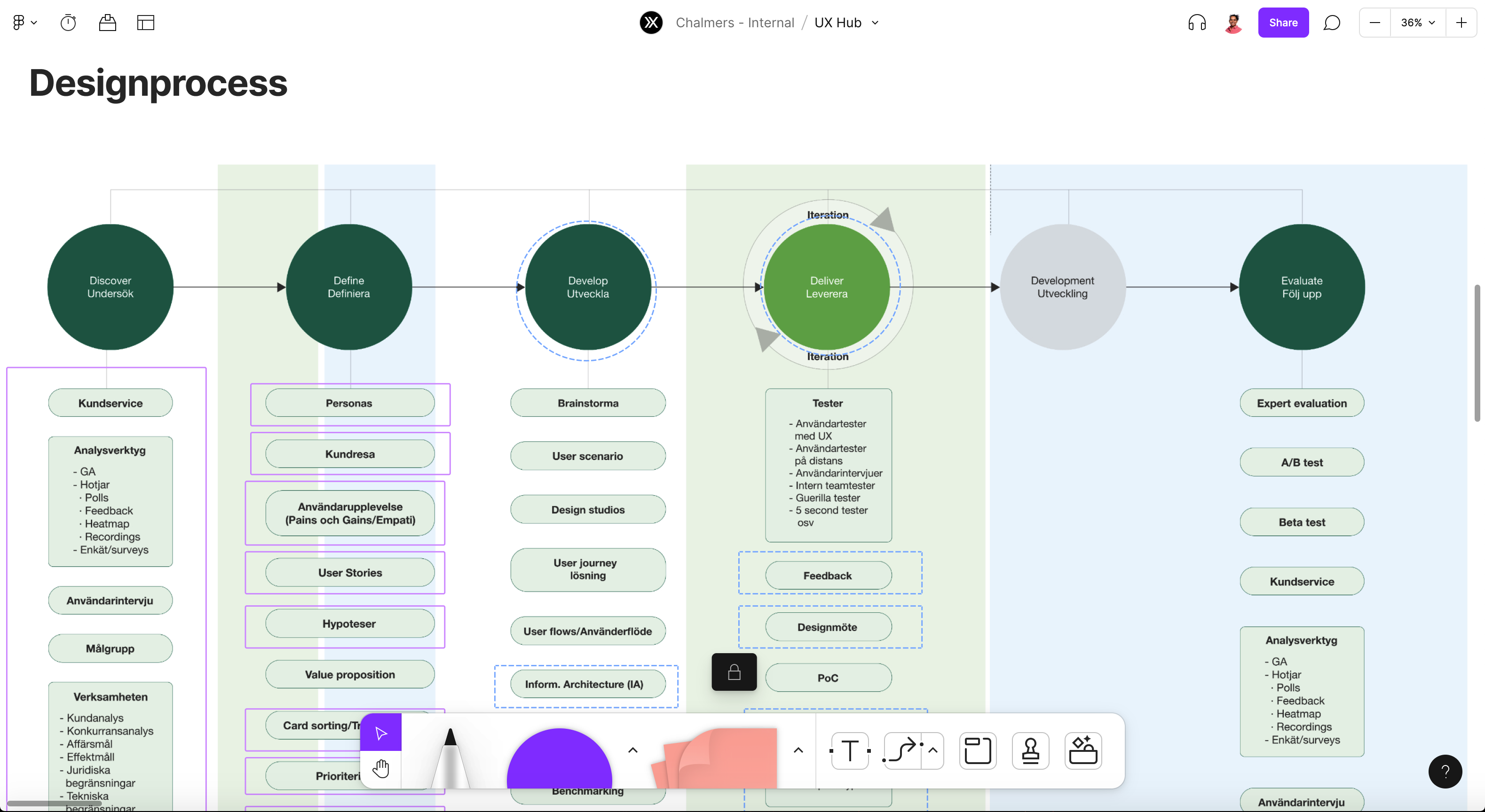
We followed the Double Diamond design process with some modifications and adaption to current Ways of Working.
Activity
• Stakeholder interviews
• Collaboration with client and product owner
• Full collaboration with development team
• Team workshops
• Design studios
• User tests
• Information Architecture (IA) & structure
• Sketching & wireframes
• Creating prototypes
• Accessibility research and report
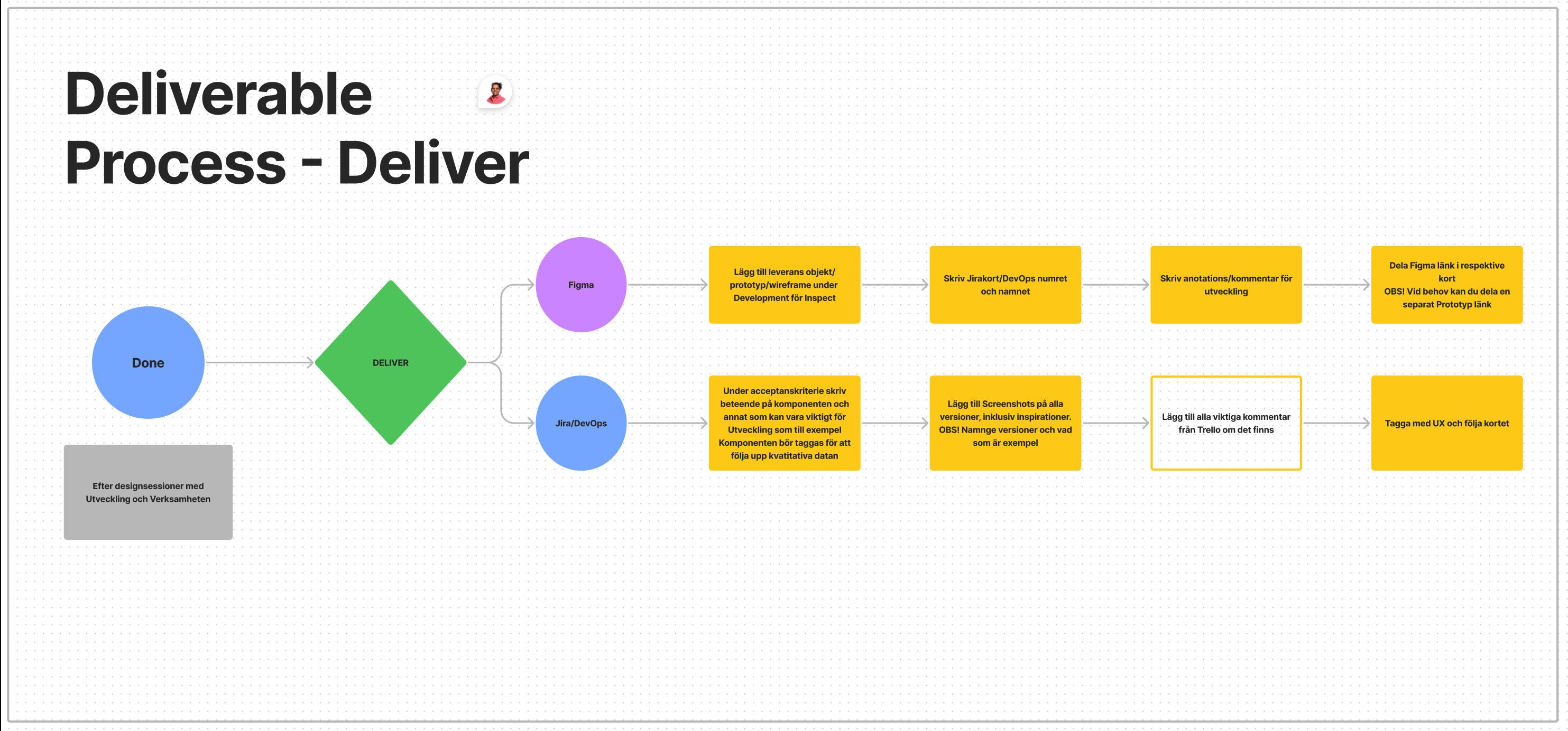
Deliverables
• Information architecture & structure
• User and UX flow
• Wireframes
• Prototypes
• User Interface (UI)
• Style guide
• UX Strategy
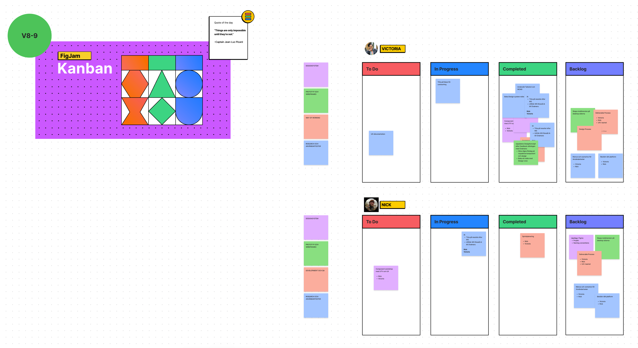
Tools
Prototyping, flow diagrams and user tests
- Figma
- Miro
Guideline for deliverables
Getting to know our users
In Phase 1 did there was some research with experts and gathering of best practices, but most importantly Users/potential users were interviewed. That way we were sure about the audience and what approximately is their experience today and what their expectations might be. This information helped to create user journeys and personas for further research in Phase 2.
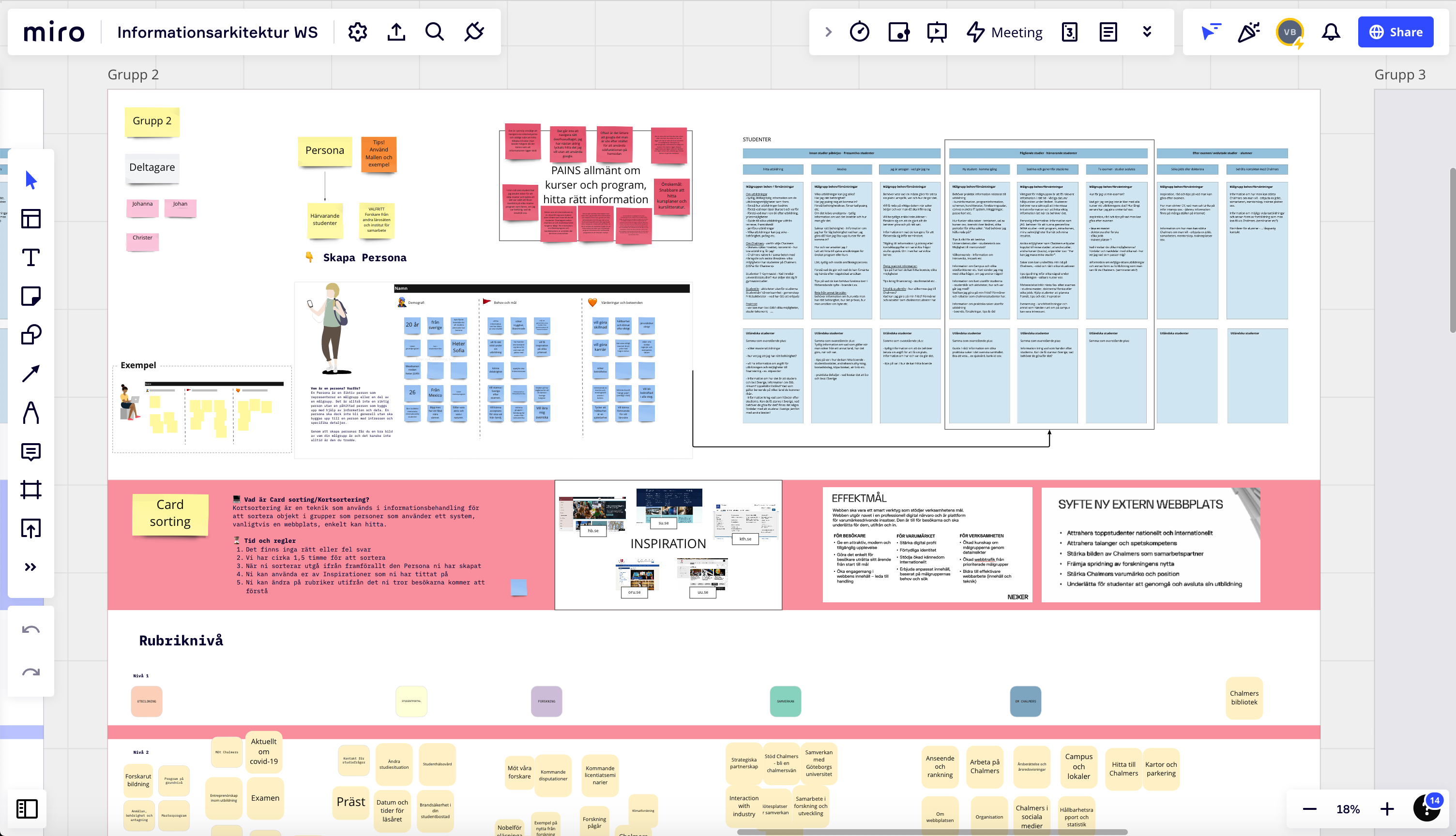
Information architecture and structure
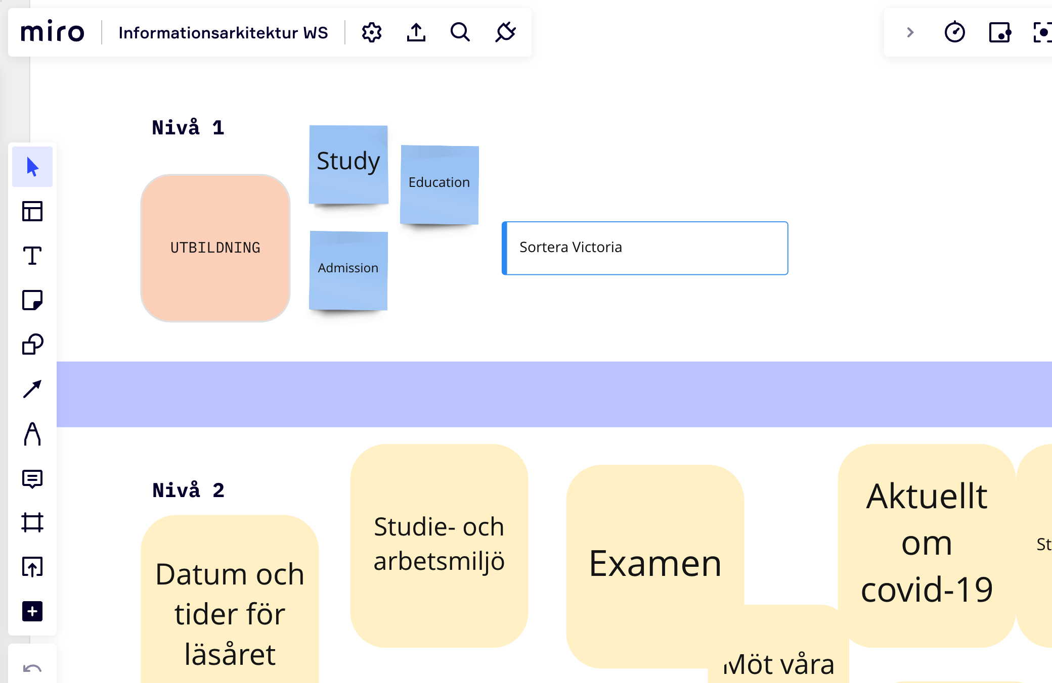
Chalmers being a University had challenges concerning structure and information architecture. The IA had many levels in the existing website and understanding where to put what was complexed. We eventually had a card sorting workshop to clear a few things and setup the IA. At a certain point some information was easier combining with other information in the hierarchy and allowing some pages to live their own life. This process took much more time than expected and Designers changed roles, we also invited other specialists to help get this together and release on time.
Design system
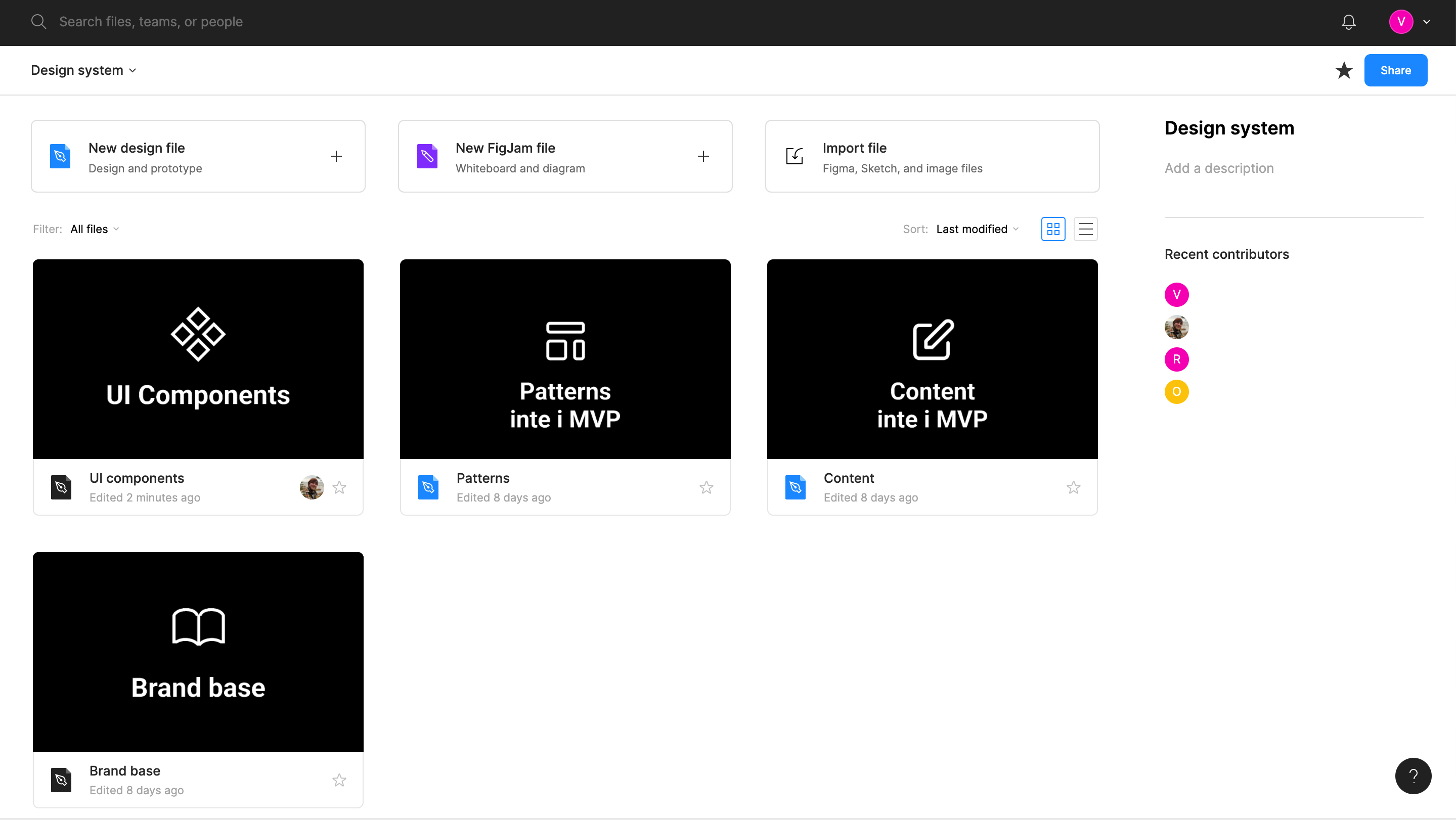
The design system was based on Atomic Design. Before gathering the design system we first agreed with the Stakeholders the visual design concept and then later on with the developers a framework and component library. Eventually we agreed on using Tailwindcss due to flexibility needed in order to create a website that follows WCAG.
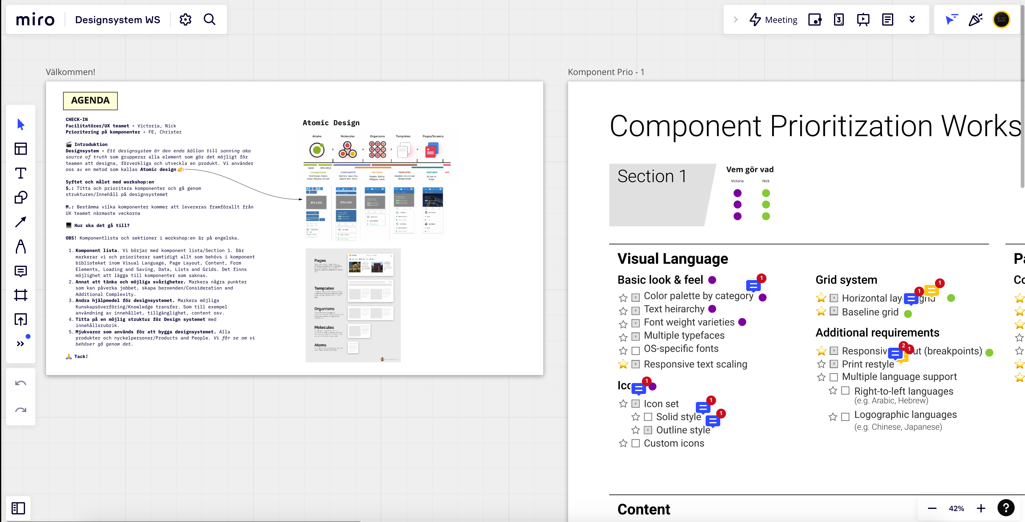
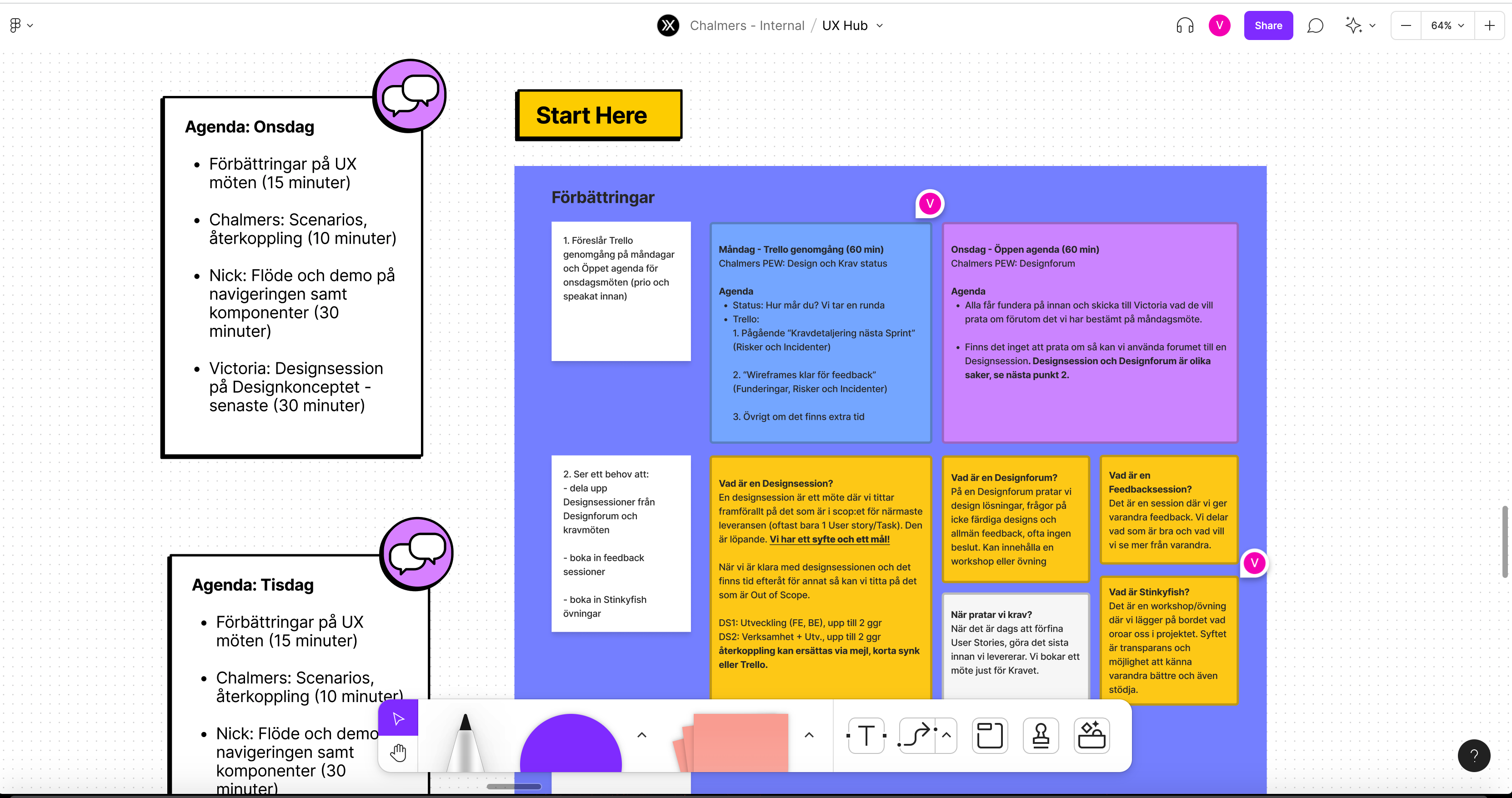
Design meetings
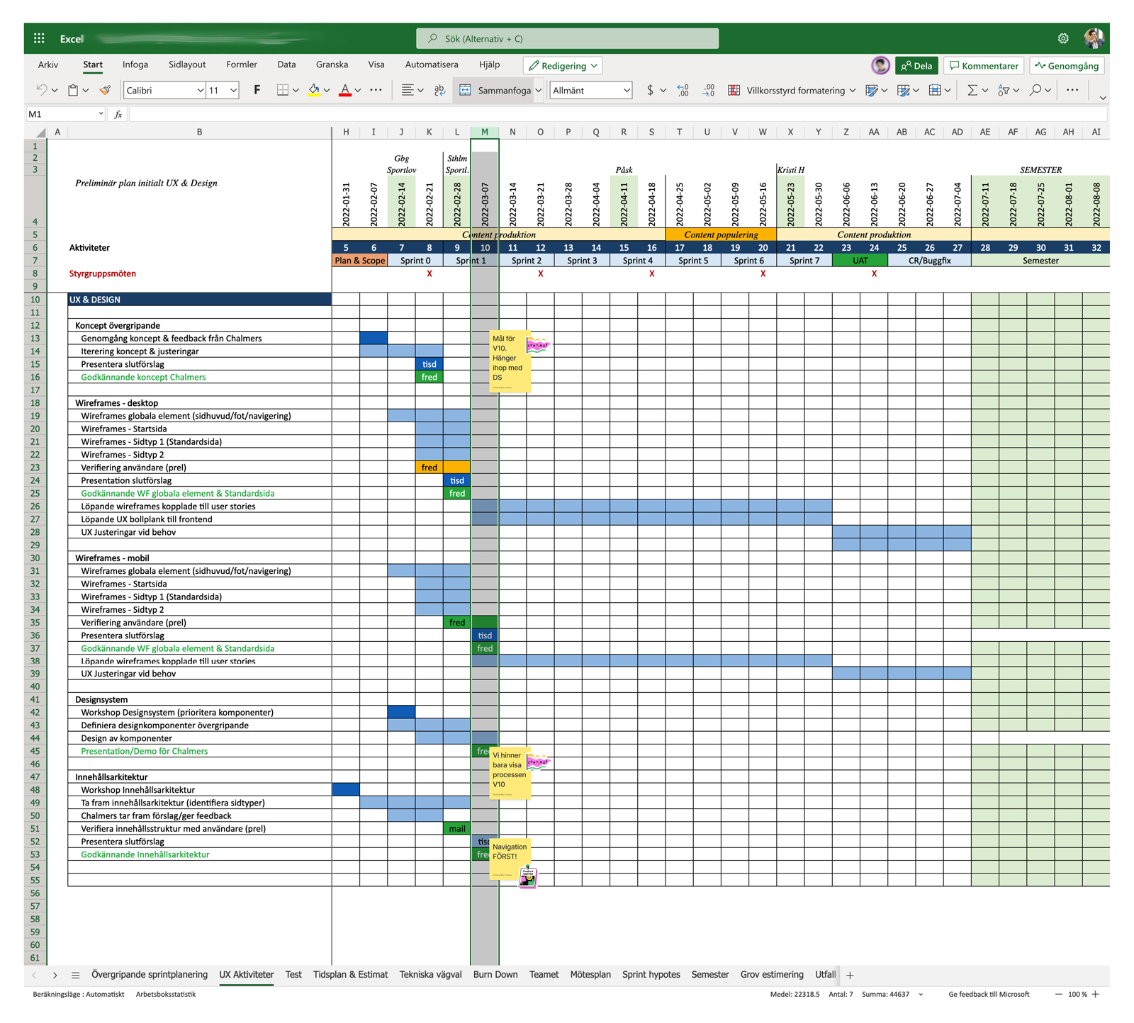
We had frequent meetings and in order to work closer with Stakeholders who already had tight schedules we booked fixed Design meetings twice a week and communicated via chatting and email.
Focusing on accessibility
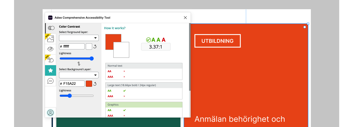
As a designer who genuinely works towards inclusive design I have helped Chalmers with their redesign according to WCAG. Visually we focused mainly on contrast, font-sizes, links and clickable areas and components, the Developers worked with their code by adding roles, ARIA, logical landmarks etc.
Wireframes to production
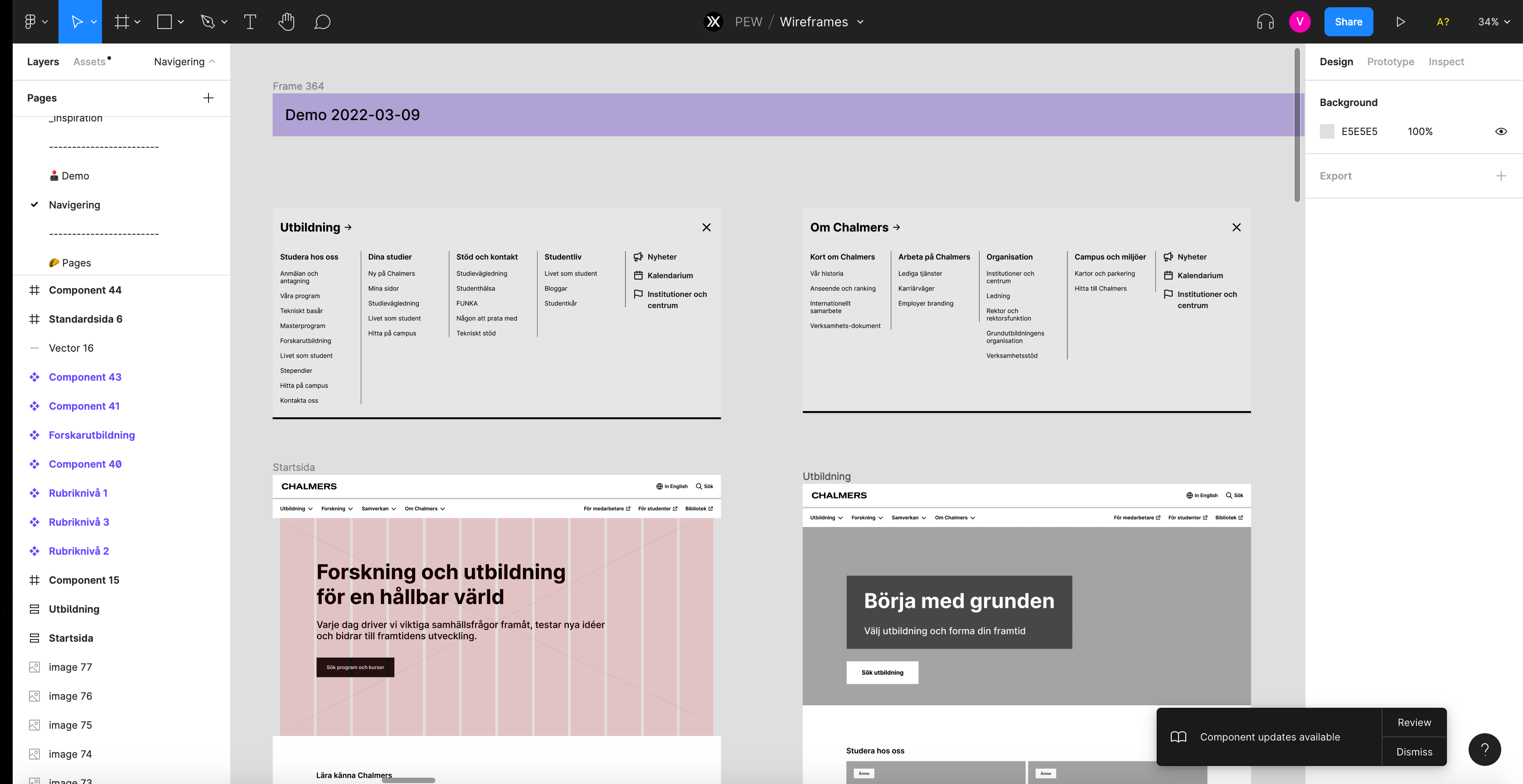
Wireframe example in Figma
Conclusion
The project was driven under lots of pressure, we learned from our mistakes and adapted to current situations. Our Stakeholders pushed for something more than MVP and everything worked out in the end. Lessons learned: for a smoother start designers should have been involved in the process a bit earlier and frequent feedback sessions would have helped create better communication between the stakeholder and tech team.
Hi-fi prototype version
Done in Figma and delivered as pixel-perfect with interactive prototype.


