Stock Exchange signal App “Optima” from Cumula
Mobile Stock exchange Signal App “Optima” from Cumula
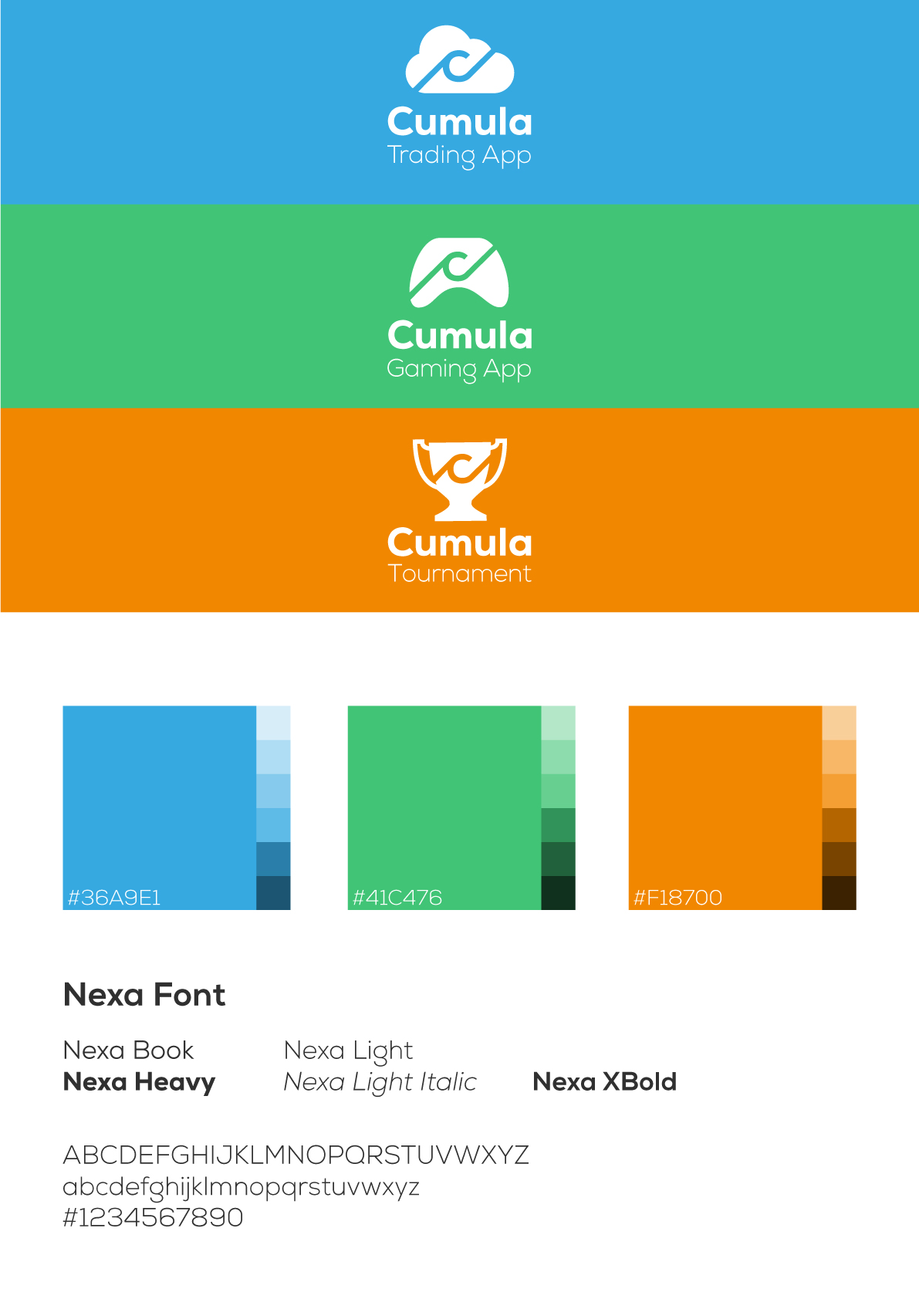
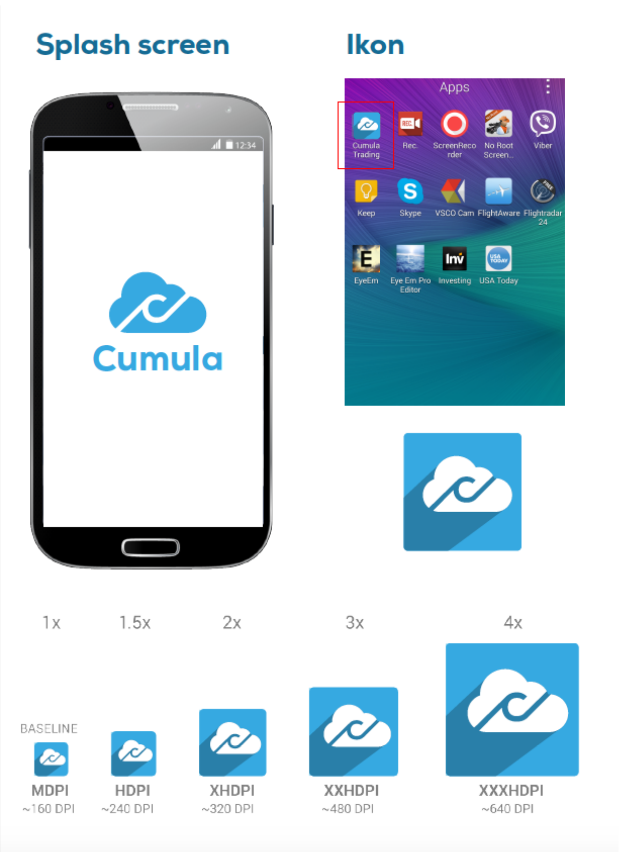
Apart from being the UI and UX designer, I also created the graphic profile, including ad photos and promo videos.
Creation and release of an Android application.
The idea behind this was to design an application for consumers from age 25 and above to easily buy and sell stocks through their mobile phone. Creating an MVP was considered to start with.
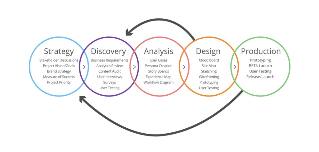
The process of this project (briefly):
1. Analysis and benchmarking;
2. Developing personas and writing scenarios;
3. Concept (flow diagram and data model concepts);
4. Creating a paper prototype and usability testing;
5. Wireframing;
6. Hi-fi prototype;
7. Conduct workshops;
8. Beta launch to Release.
UX Design sprint process
Some feedback from User Interviews
Can you plan and do stock exchange business using the mobile phone?
Yes, provided it is connected directly to my bank account.
***
What do you think about the idea of buying and selling signals directly on the mobile phone?
Totally on time. However, it would be nice to receive notifications everywhere, e.g. E-mail.
***
What do the stars mean?
Bad or good signals. Quality of the signal.
***
In front of you is a signal view. How do you perceive the app's signals?
Clearly and understanding. I like that it says Buy signal and Sell signal. I would like to find the ones that are followed.
Main features and guide


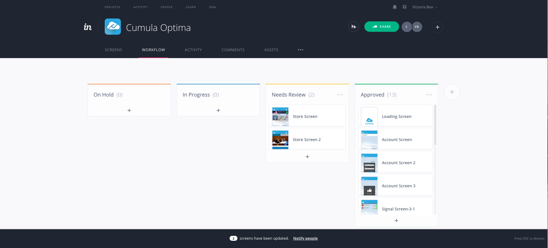

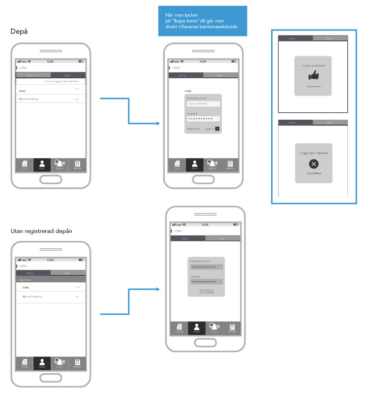
Mobile app - User flow chart for registration
Application guidelines for developers
Filming and testing products


Main website
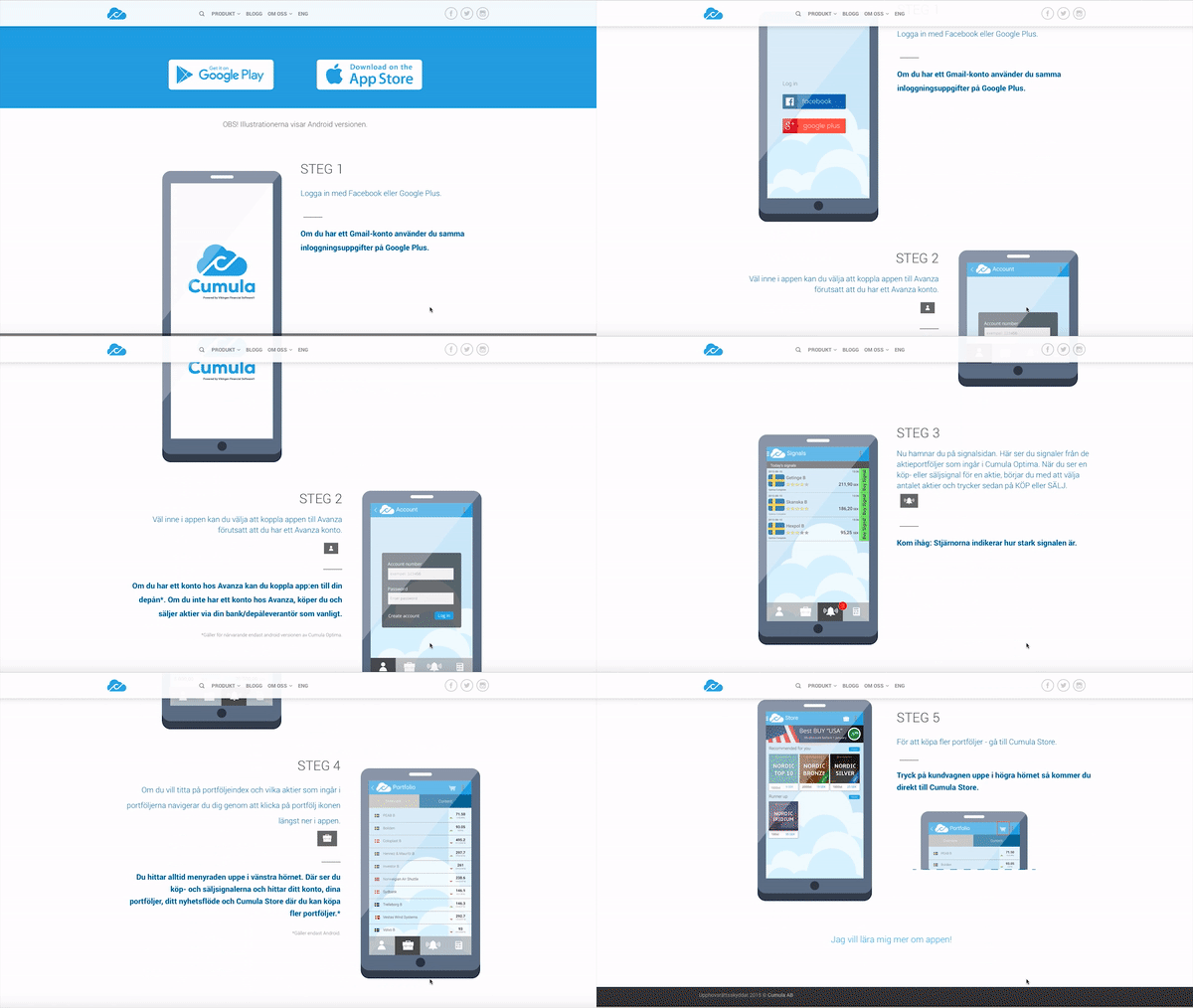
Based on previous feedback and research we created a website with not only information about the product, but also a page where the user could experience the product and learn a few tips on how to make better sales decisions.
Art Direction

